
IMAX, or Image MAXimum, was created by a small group of Canadian experimental filmmakers who came together to produce a multi-screen film installation at EXPO ‘67 in Montreal. It was part of a competition to create the first genuinely large-screen film experience. The filmmakers did it by syncing nine projectors together, as a huge technological challenge. And as they pulled it off, the ambitious team started the company in 1970 when they finally invented their epic camera, projector and domed screen system, which premiered at the Fuji Pavilion at EXPO '70 in Osaka, Japan. The first installation of IMAX was made in 1971, at Ontario Place's Cinesphere in Toronto, Canada. But then, in 1994, IMAX went public around the globe, including Hollywood.

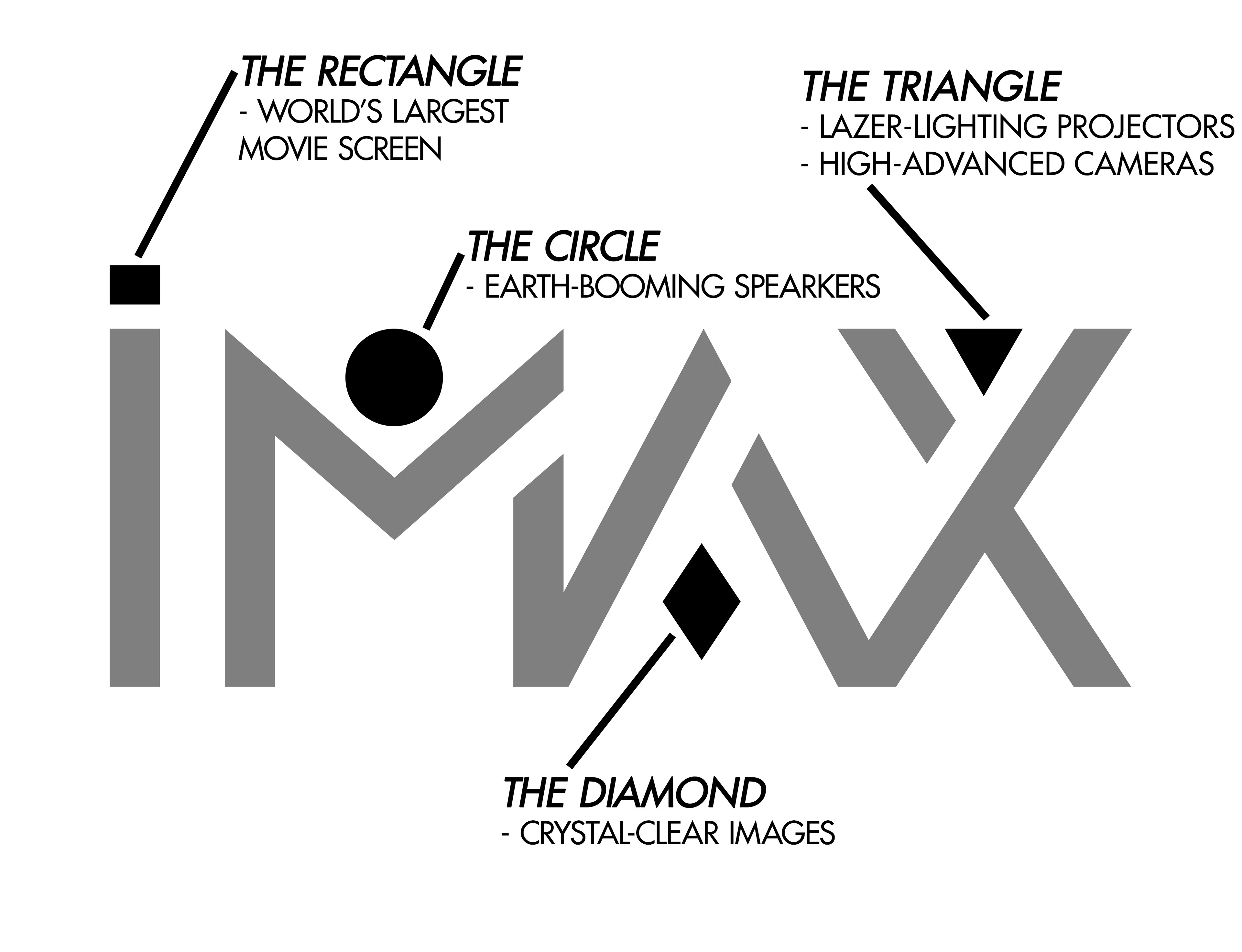
When I thought about creating a new IMAX logotype, I had a hunch about making a guide for newcomers by using shapes as symbols of the features in an IMAX cinema. For example, its projector creates images that are all “crystal-clear” on the screen. And by the word, crystal-clear, I thought about a shiny diamond glowing in the dark. Every shape located around the letters symbolize the experience of what the audience is about to enjoy.
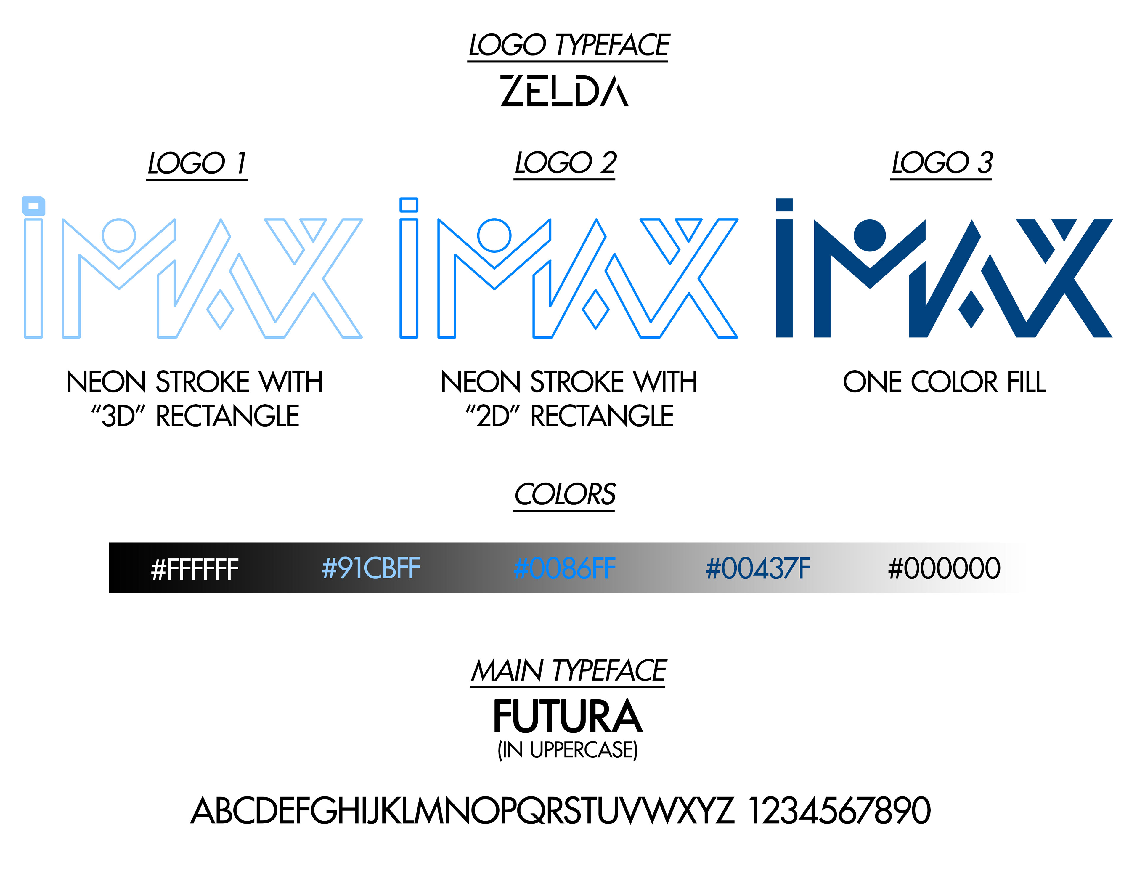
I used a typeface called, ZELDA, to help the logo being in the emotion of excitement to its viewers and to educate them about what the company is all about. I designed the logo to be in different versions, including one in full color and the other fully transparent with a “neon-like” stroke, which is the outlines of the logo itself. There are two stroke versions with a different feature. The rectangle in the stroke version can be in a “3D-look” or even 2D because IMAX can display its film in 3D and 2D as well. But, when it is in an advertisement, they will have one of the most popular typefaces called, FUTURA. I thought about that as their primary typeface because of the term ‘future’ and how it represents the expandable success of the company.
My letter to Richard Gelfond, Danny Tu, and the IMAX Corporation
For 50 years, it has been for this experience to evolve entertainment. All of the creative technology you have designed had made an incredible surprise to the world. Even though that you did not change for a long time, I decided that I would recreate the branding of IMAX, including the logo itself. No offense about the criticism of the original logo, but when I look at it, I makes me feel awkward and boredom. And I didn't find it very interesting when I first visited one of your theaters. And since I have been going to IMAX theaters, I had been asking myself what if I make a "pamphlet" about IMAX for those who do not know what it is. And that is why I thought about re-branding the idea, structure, and experience of IMAX for the audience to understand better. Although that I wanted to re-brand the corporation, I would never plan to change the way you design cameras, projectors, images, speakers, and screens. And that is because for 50 years, you have given us a thought of entering the new reality during an ultimate movie experience.
Happy anniversary, IMAX! This re-branding idea is for you.
50 years!