
"The BBC has commissioned a new typeface, BBC Reith which will make text easier to read on screen and “will also save the BBC money”. The “master-brand” typeface is named after the organisation’s founder Lord John Reith, and has started to be rolled out gradually starting on BBC Sport."
- Lucy Bourton from It's Nice That / Friday 11 August 2017 (https://www.itsnicethat.com/news/bbc-reith-typeface-graphic-design-110817)
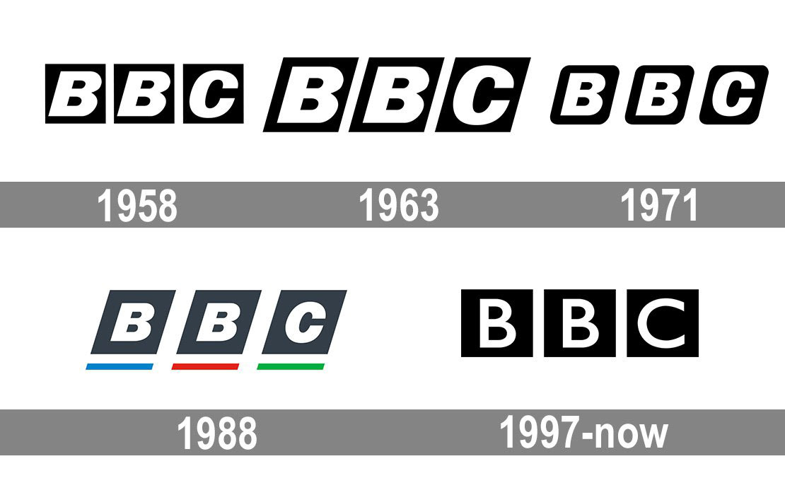
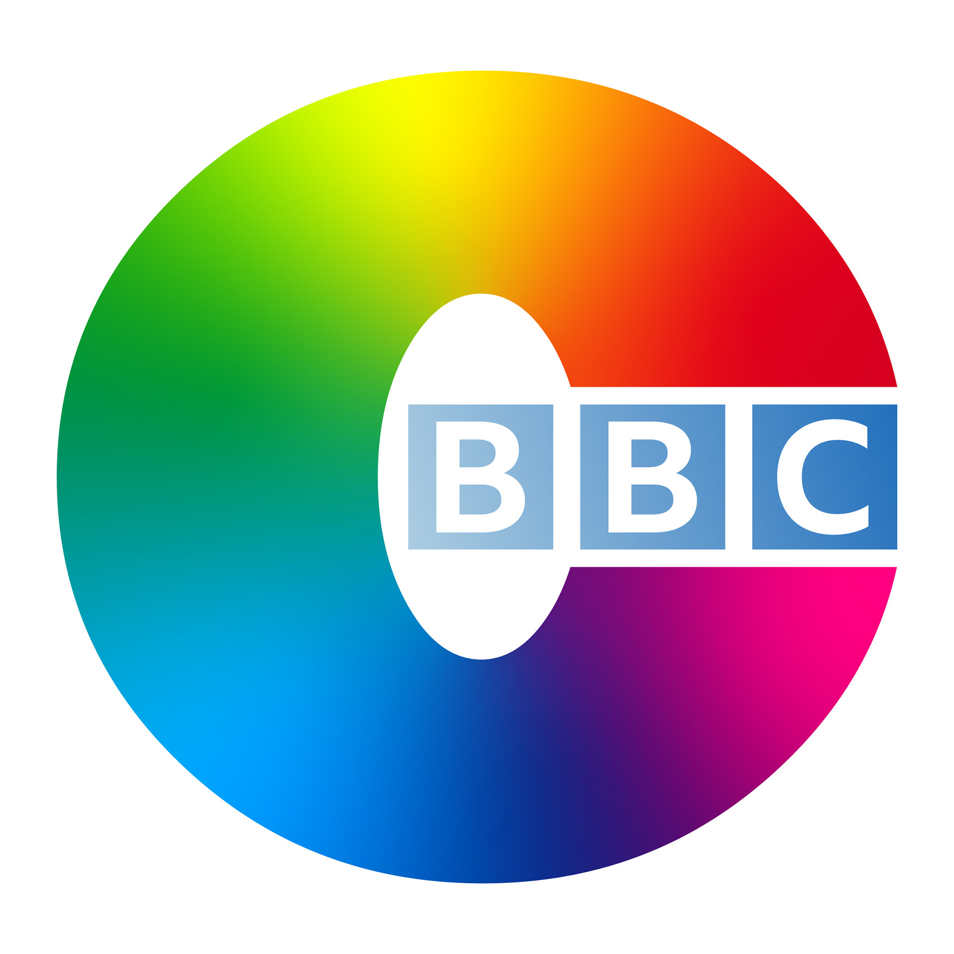
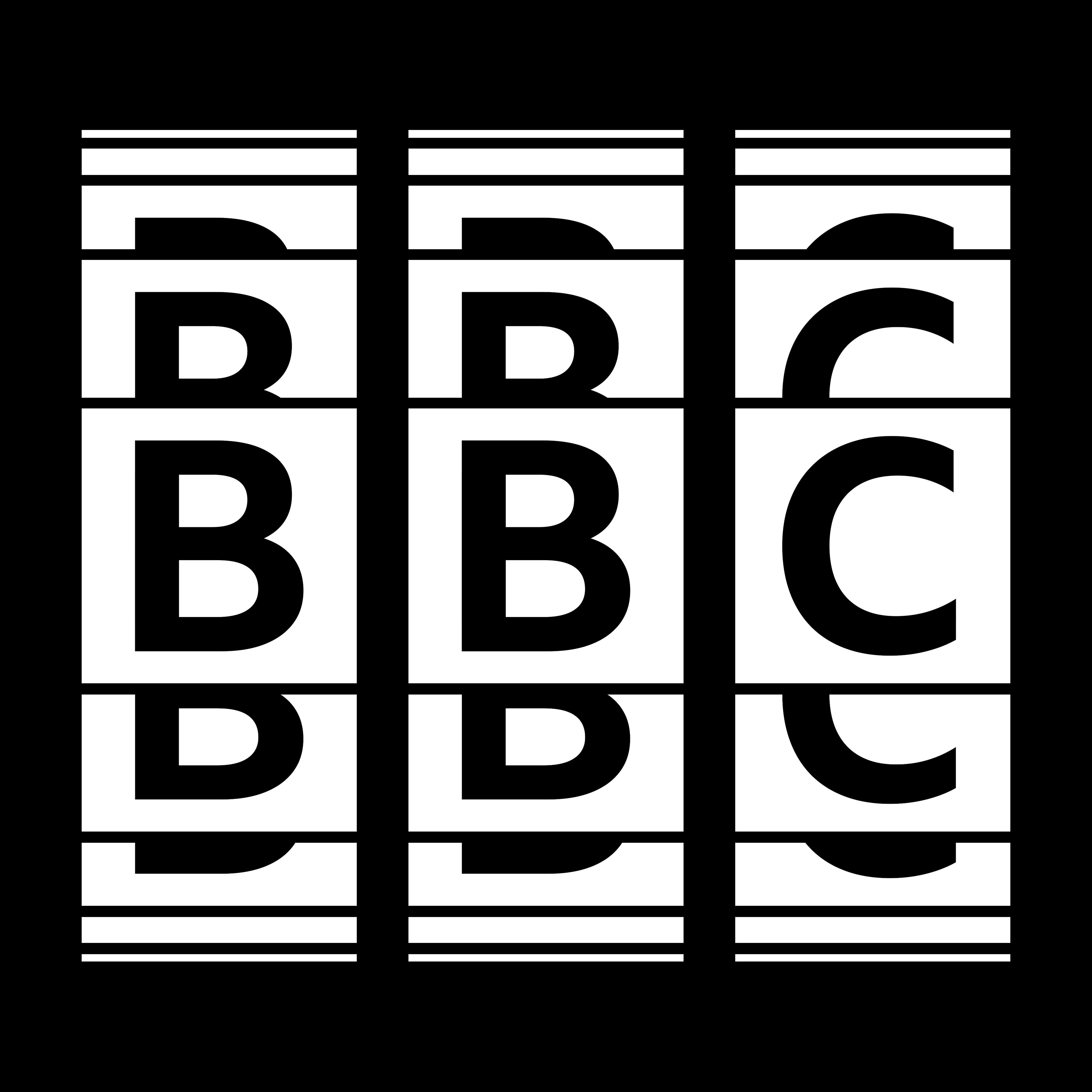
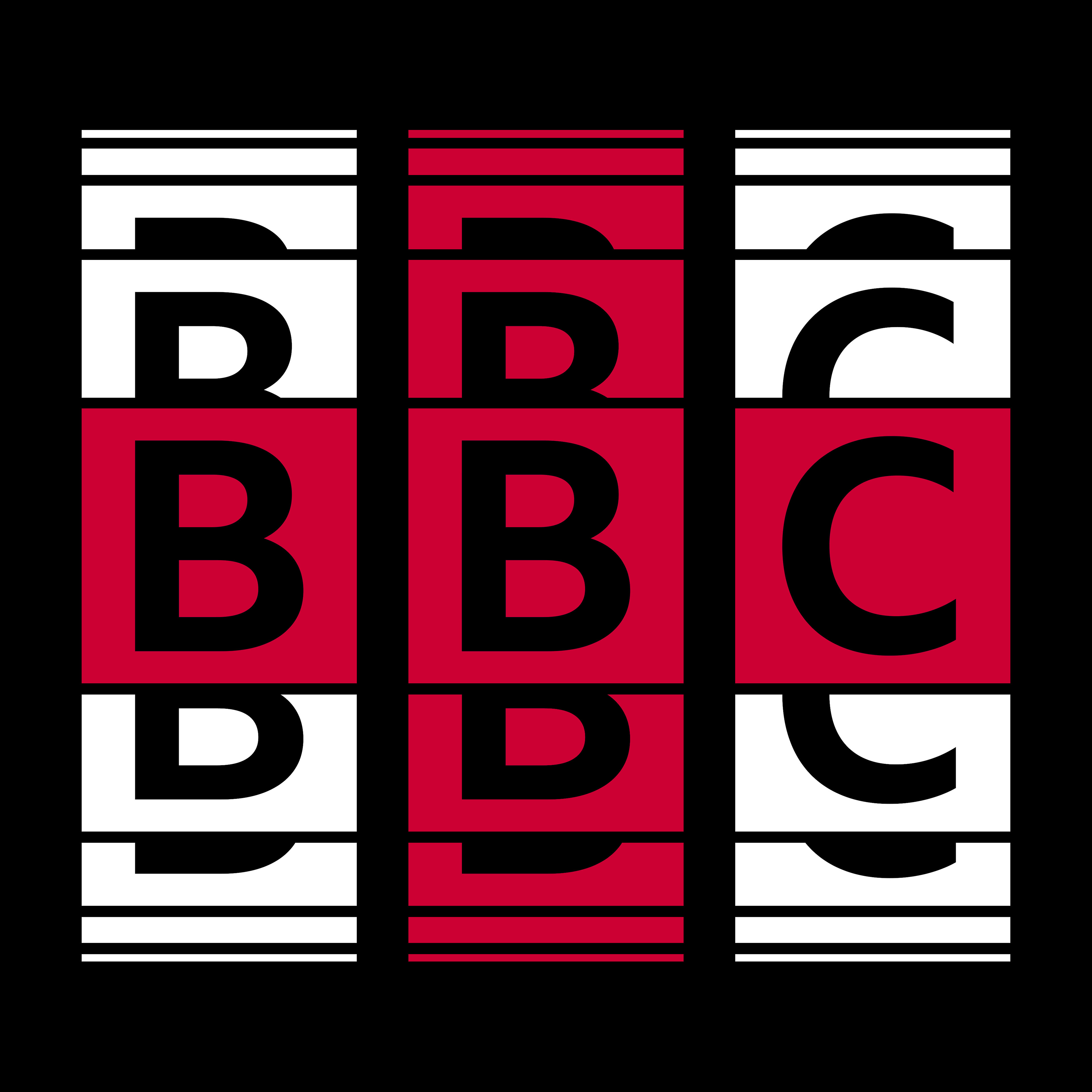
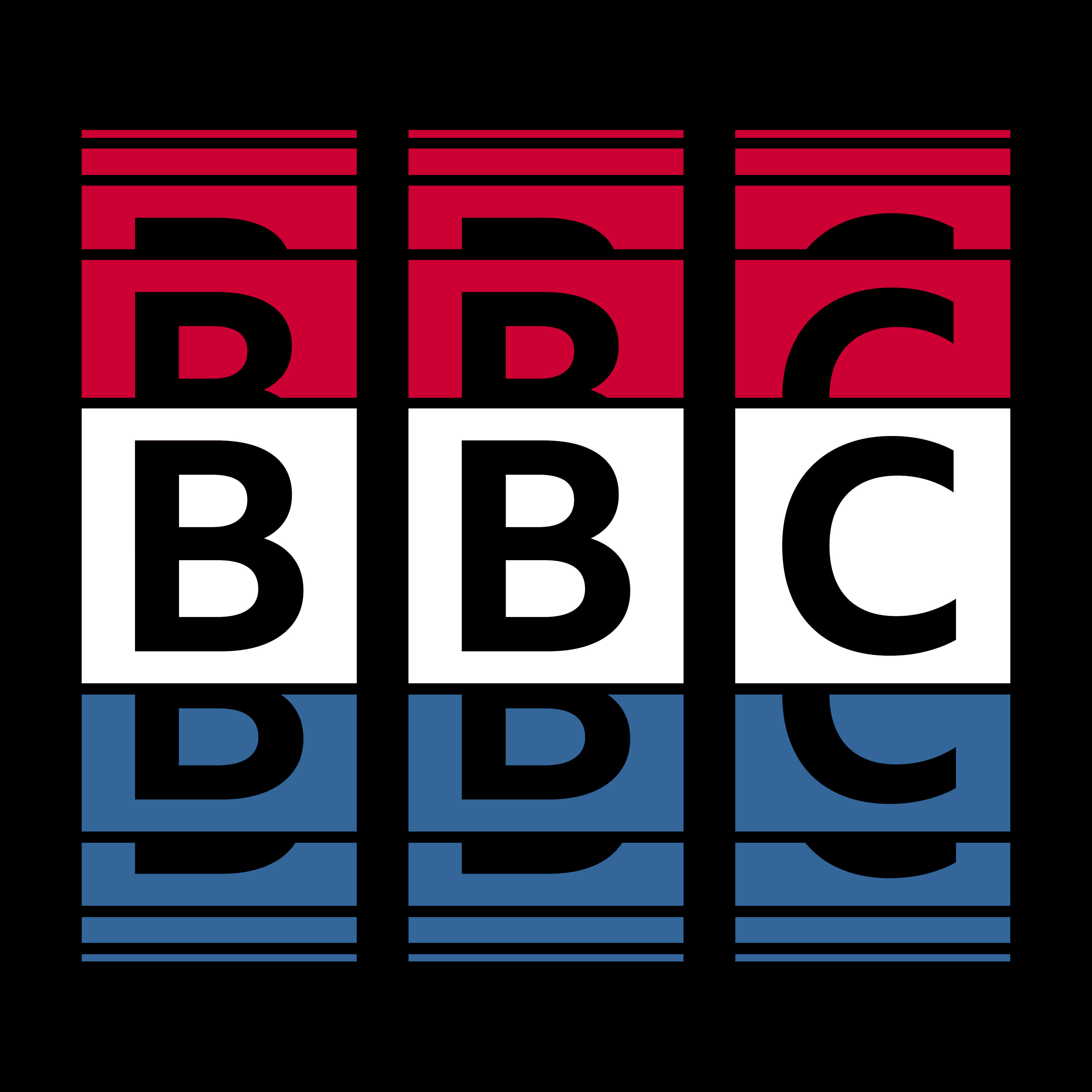
As a big fan of British entertainment, including the British Broadcasting Corporation, I had a thought about the BBC logo the company has throughout its time of existence. From 1958 to 1988, its italicized typeface, possibly Univers, was displayed from their logos while its squares changed proportions and edges. Their 1988 logo features another typeface, Helvetica Neue, brought back the points of the squares, and added colored underlines below the quadrilaterals. And for their 1997 and current logo, the logo's squares returned to their original position and featured a classic typeface, Gill Sans, for its new look.
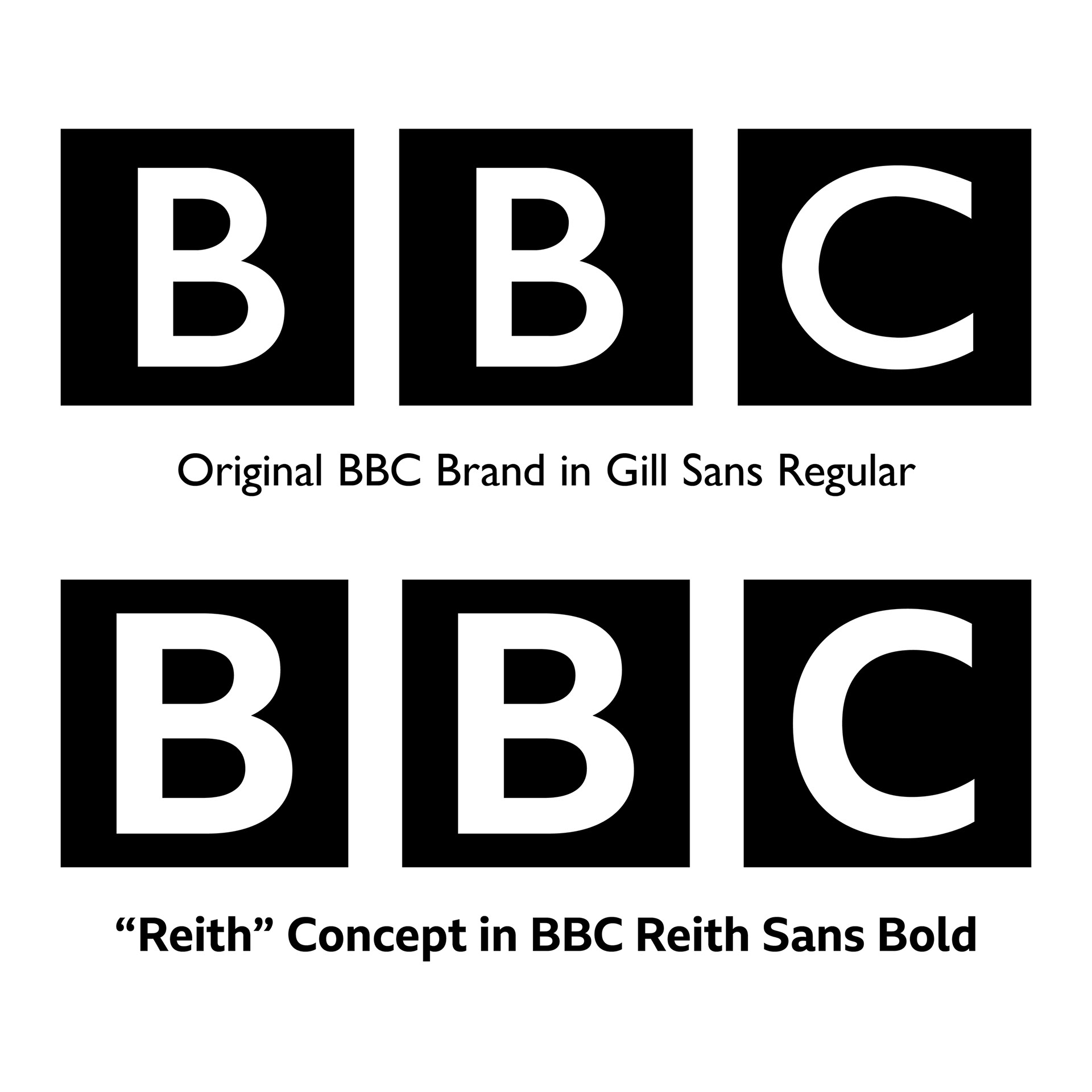
Let's compare to their current logo and the 'Reith' concept logo I designed in the right image above. Both typefaces, Gill Sans and BBC Reith Sans, may have a similar style, but they have different features. The width of the B's upper counter in BBC Reith is longer than the other in Gill Sans. The width of the C in BBC Reith is thinner than the other in Gill Sans. The typeface's weight in the 'Reith' concept is in bold, and they reflect the BBC's classic look from 1958. But compared to the other logos, the typefaces from the current logo and the concept are not italicized. And for the 'blocks,' the original logo's are almost equilateral squares, based on their width. The 'Reith' concept's 'blocks' are equilateral designed in mathematical vector.
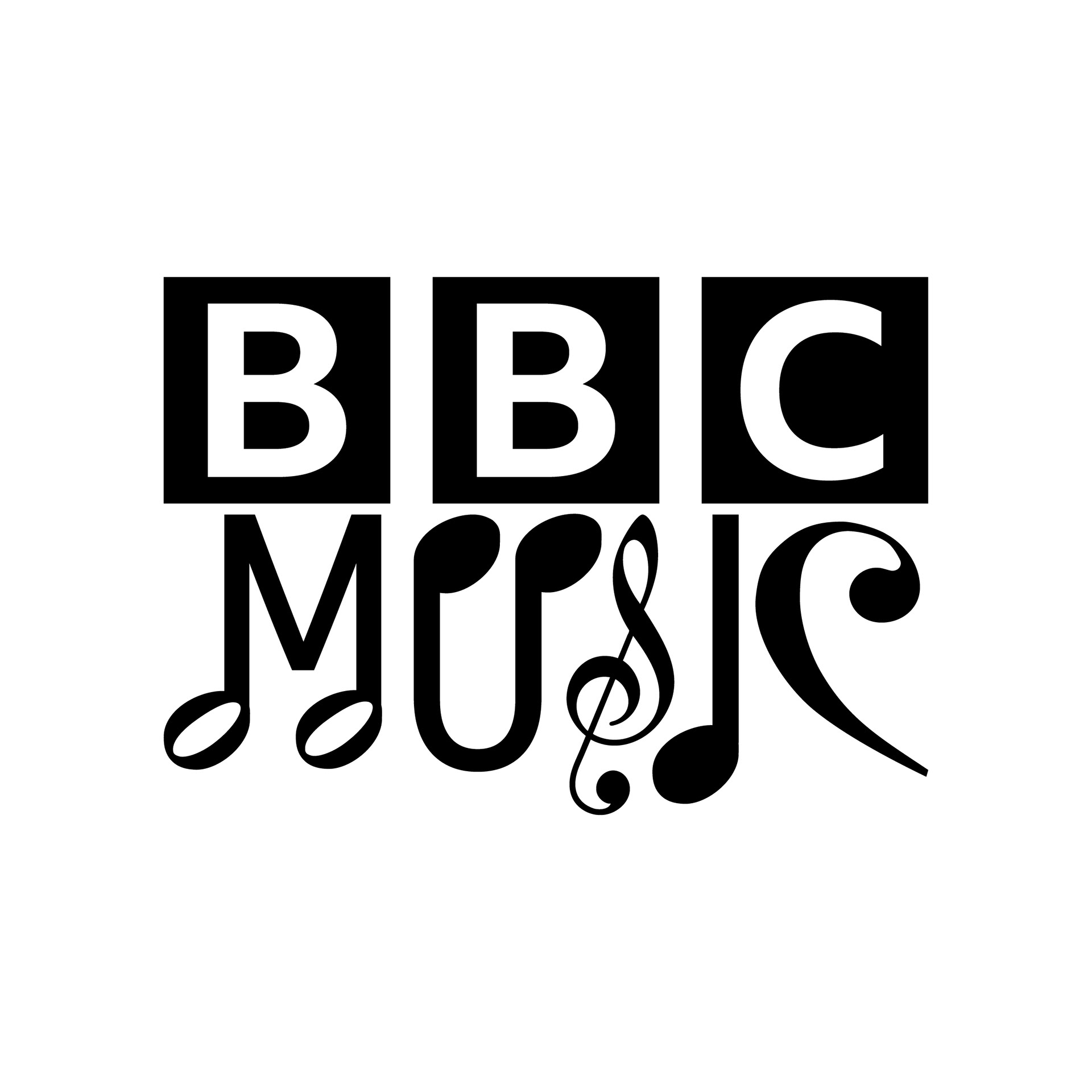
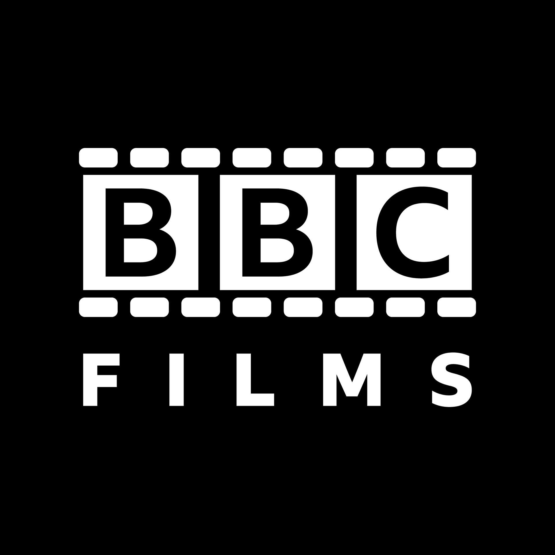
Since the typeface, BBC Reith (Sans and Serif), was announced in August 2017, their branding is slowly changing throughout using their owned-brand font. So, I have done some experimentations with their branding by adding new looks, formats, style, and tone, with their typeface all included. And since BBC Reith is a company-owned typeface, like Apple’s San Francisco, Google’s Product Sans, and YouTube’s YouTube Sans, I believe that the BBC may use their font to update their complete logo and brand collection they own. It’s the reason why I’ve done some of the brands for the BBC so their creative team could handle the rest.
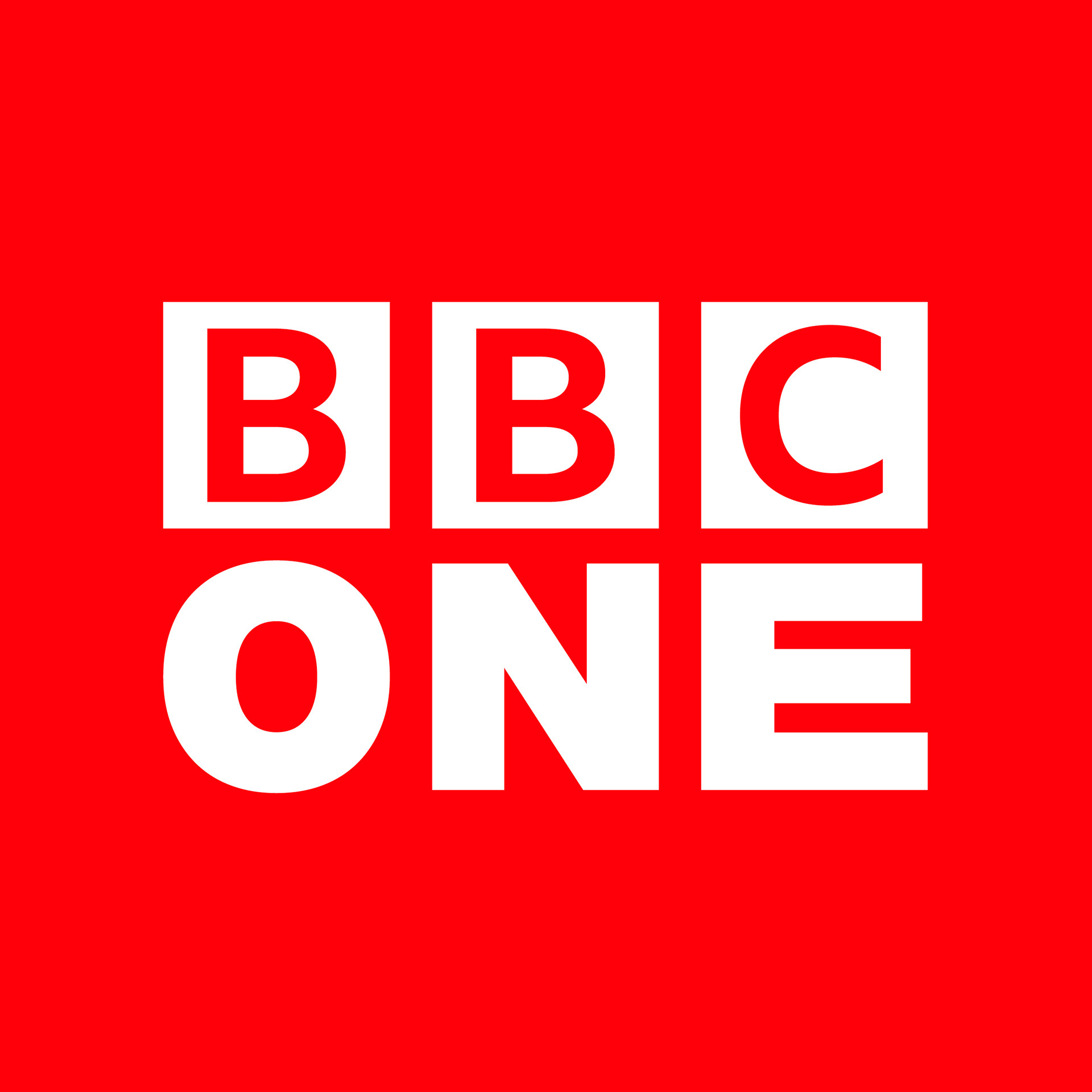
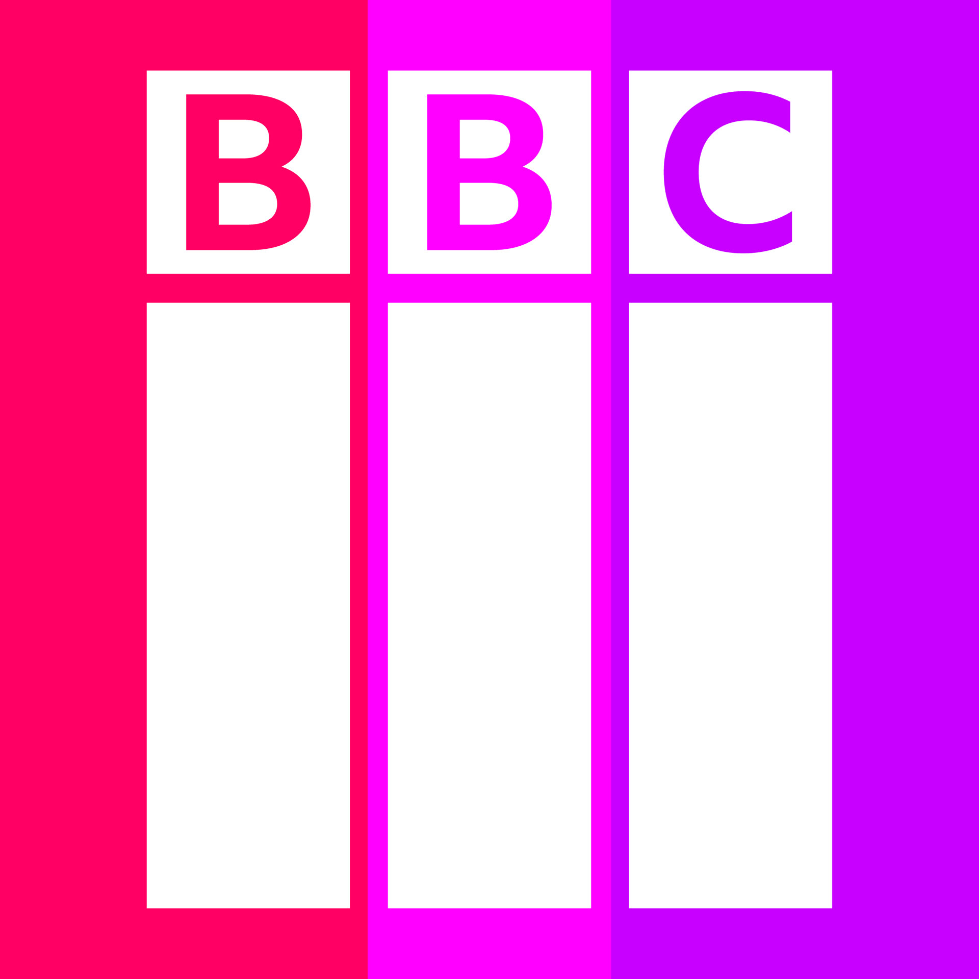
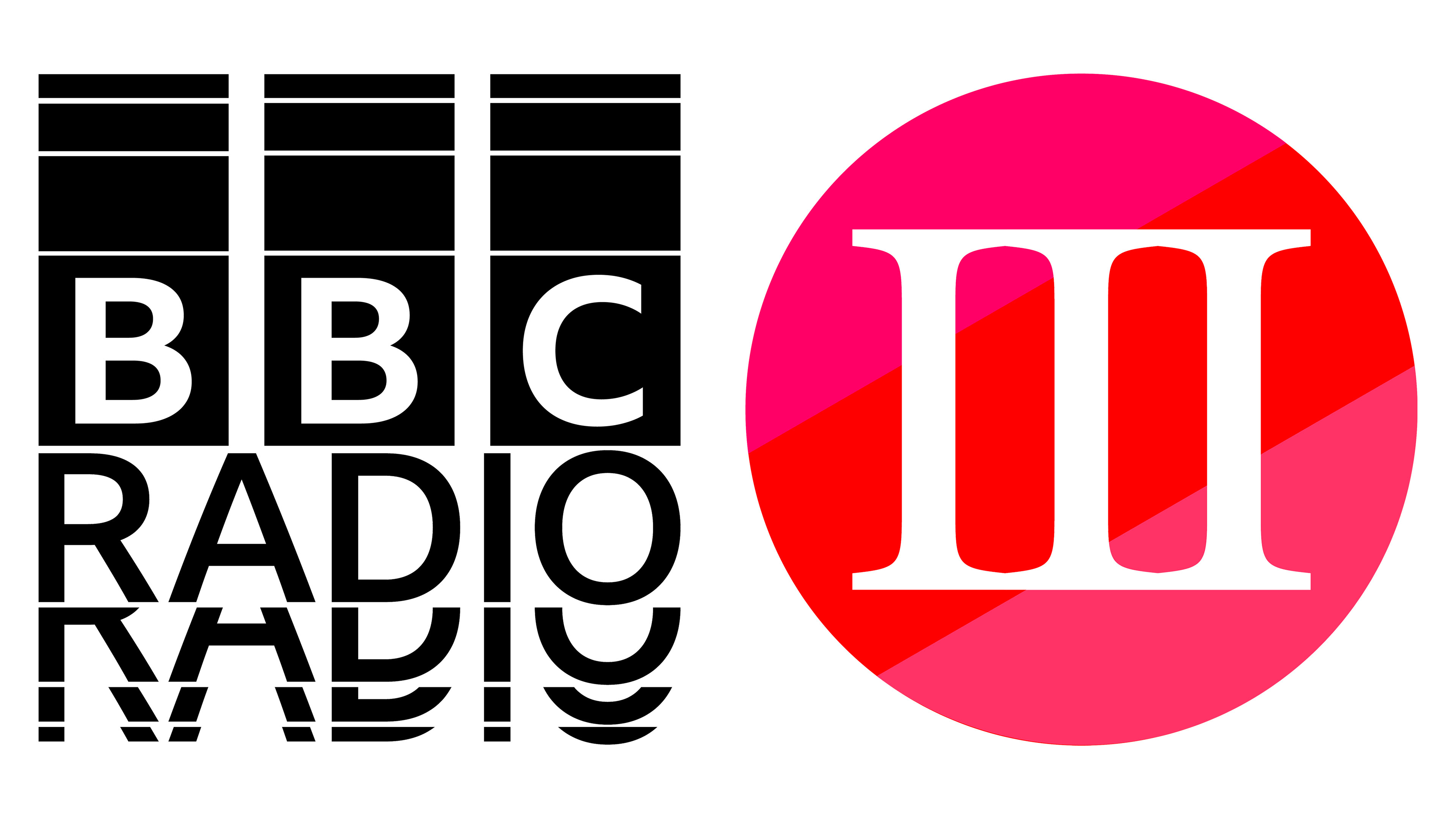
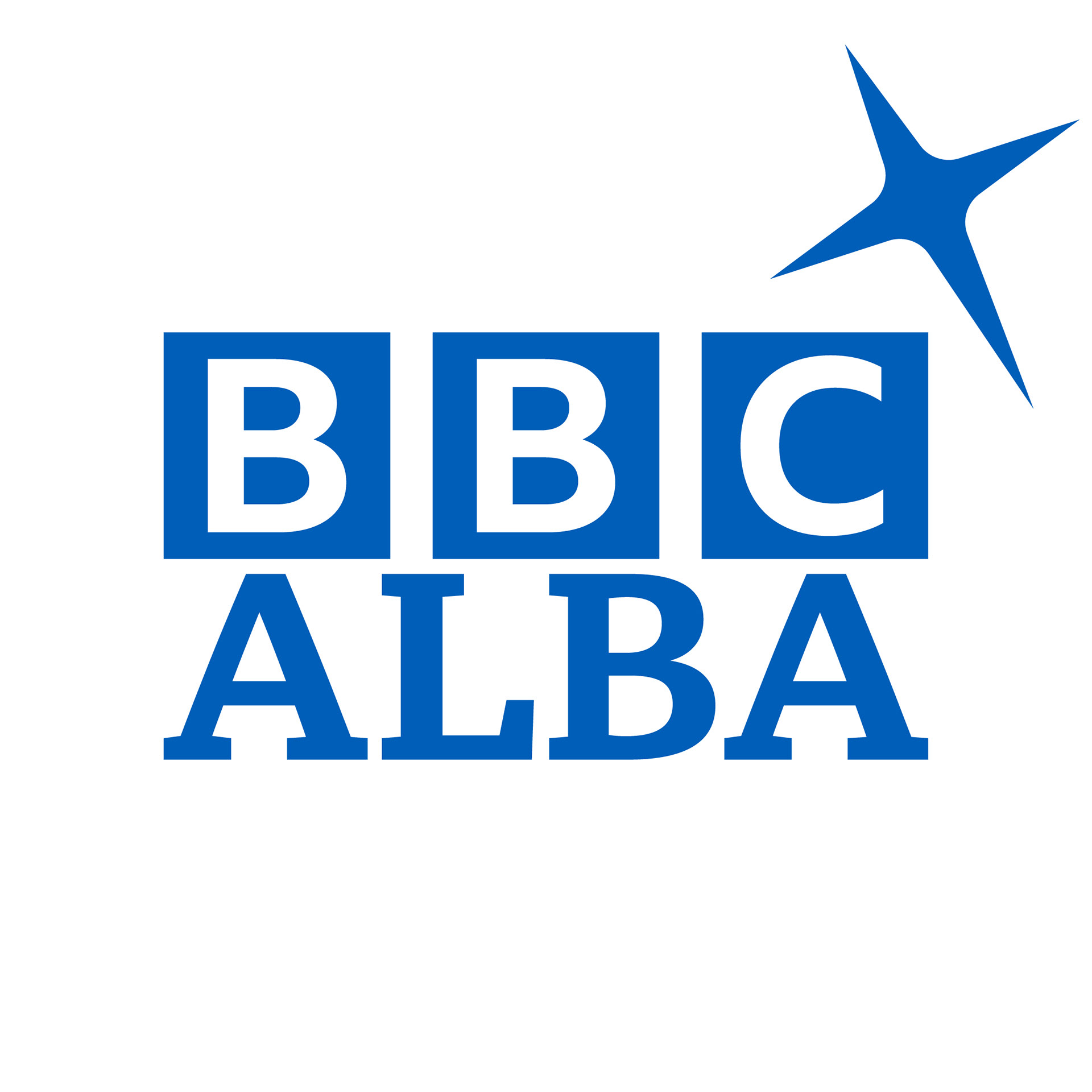
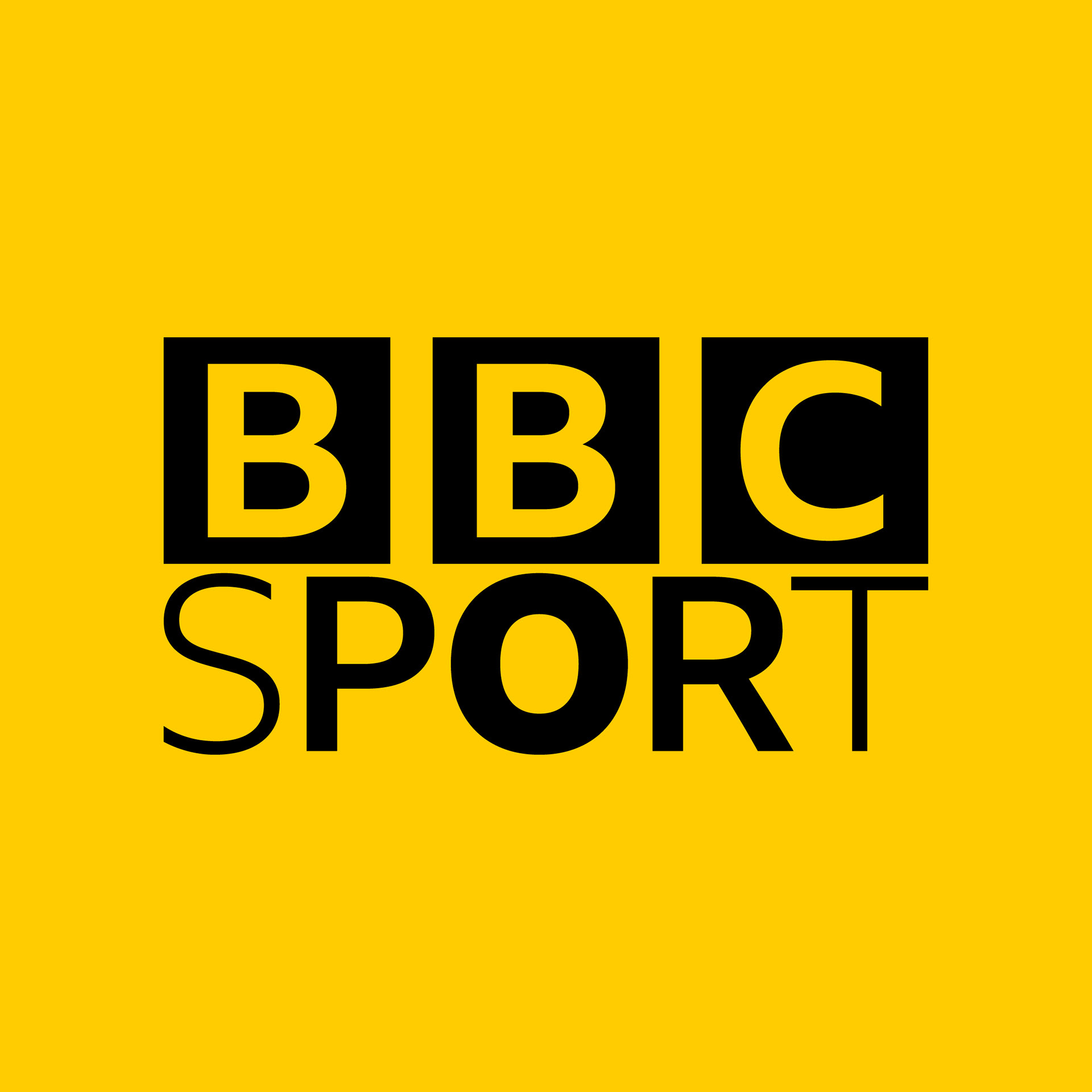
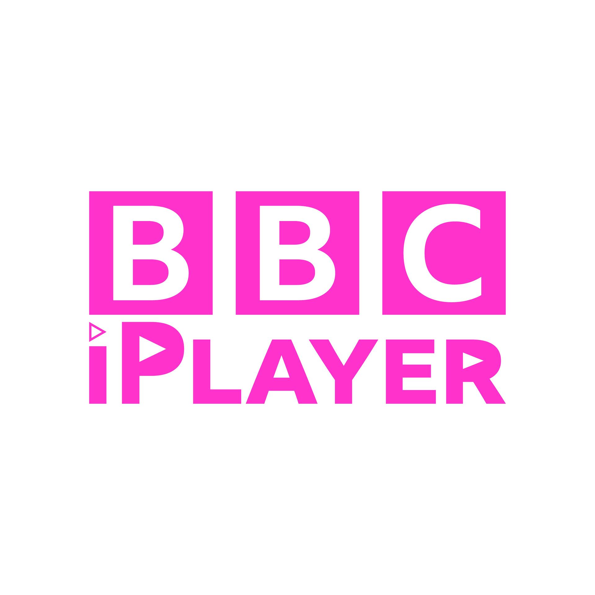
Official BBC Channels (UK)
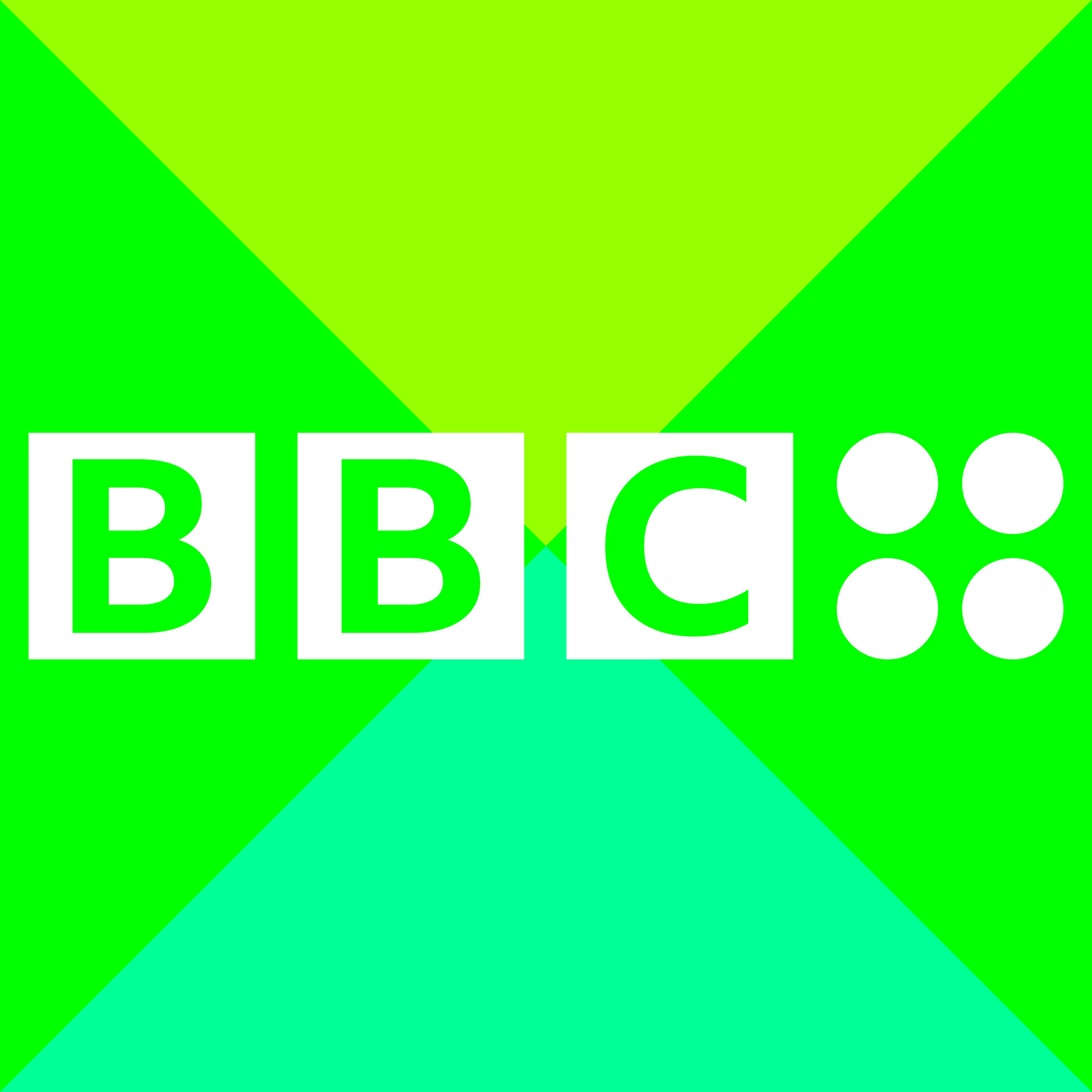

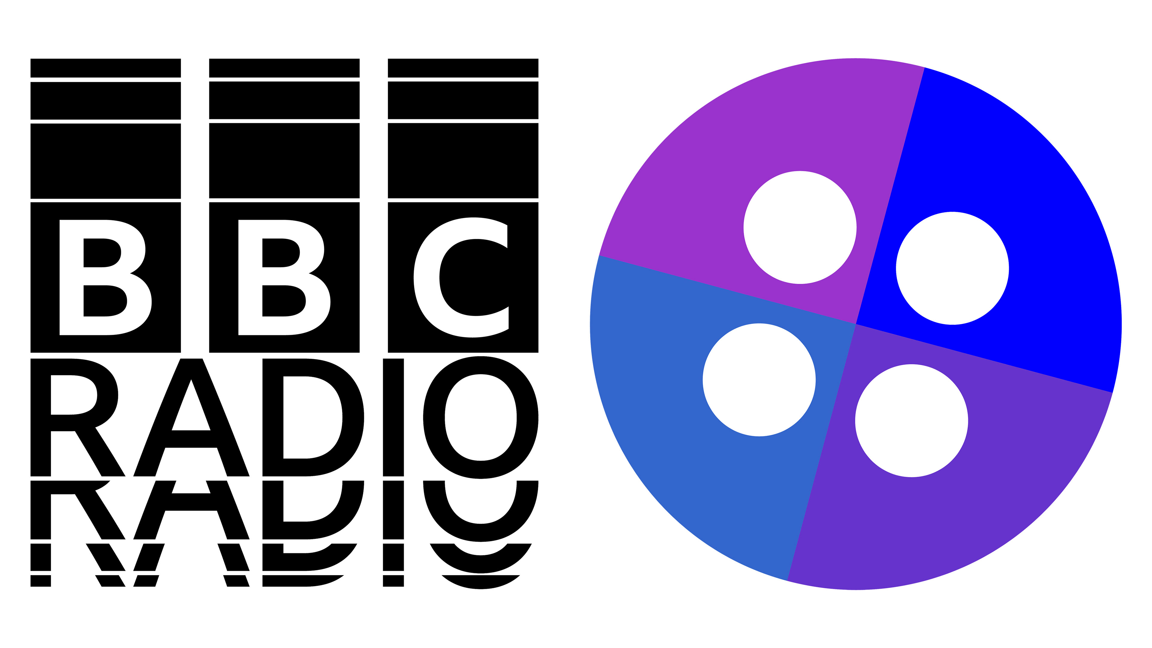
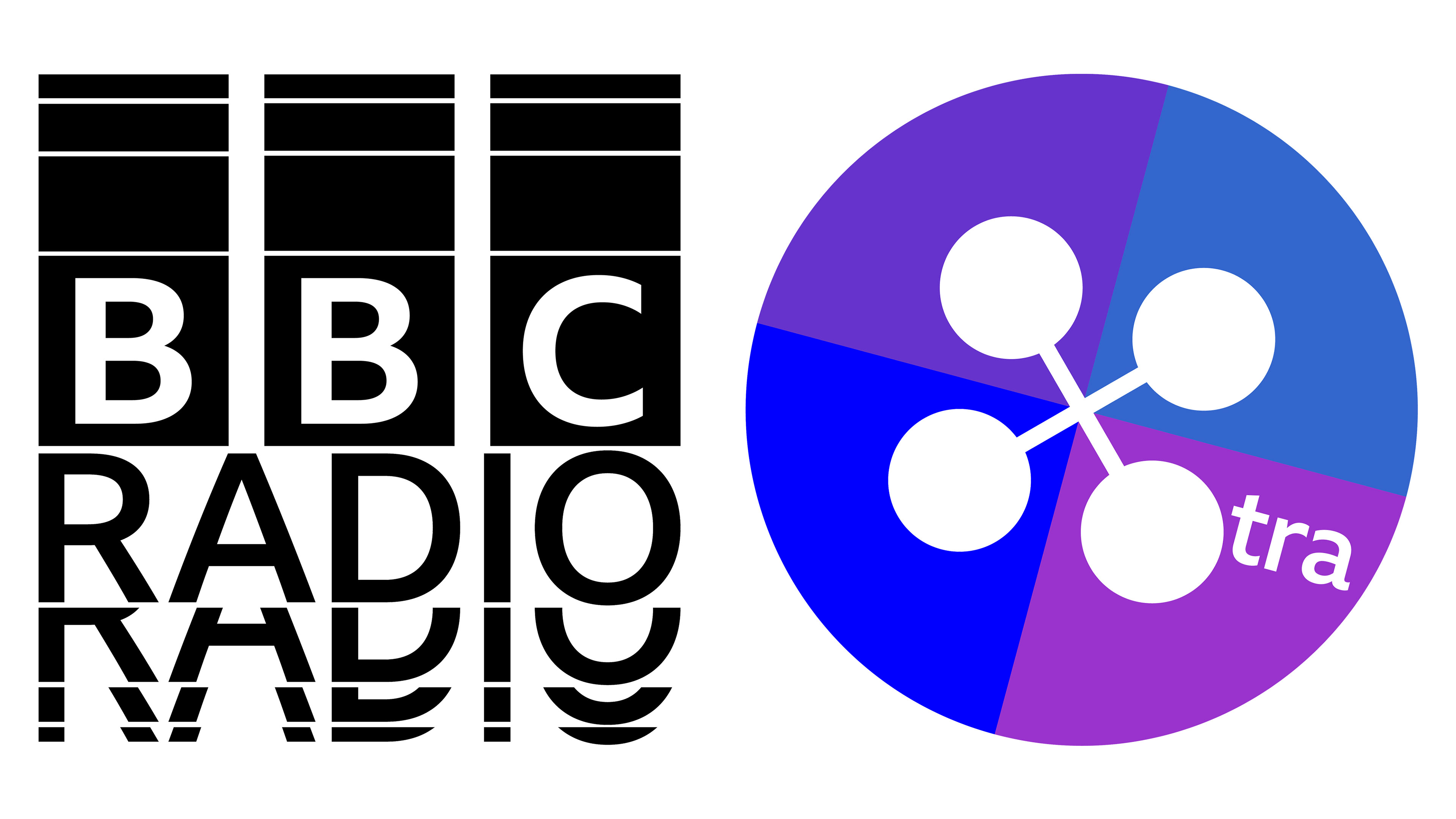
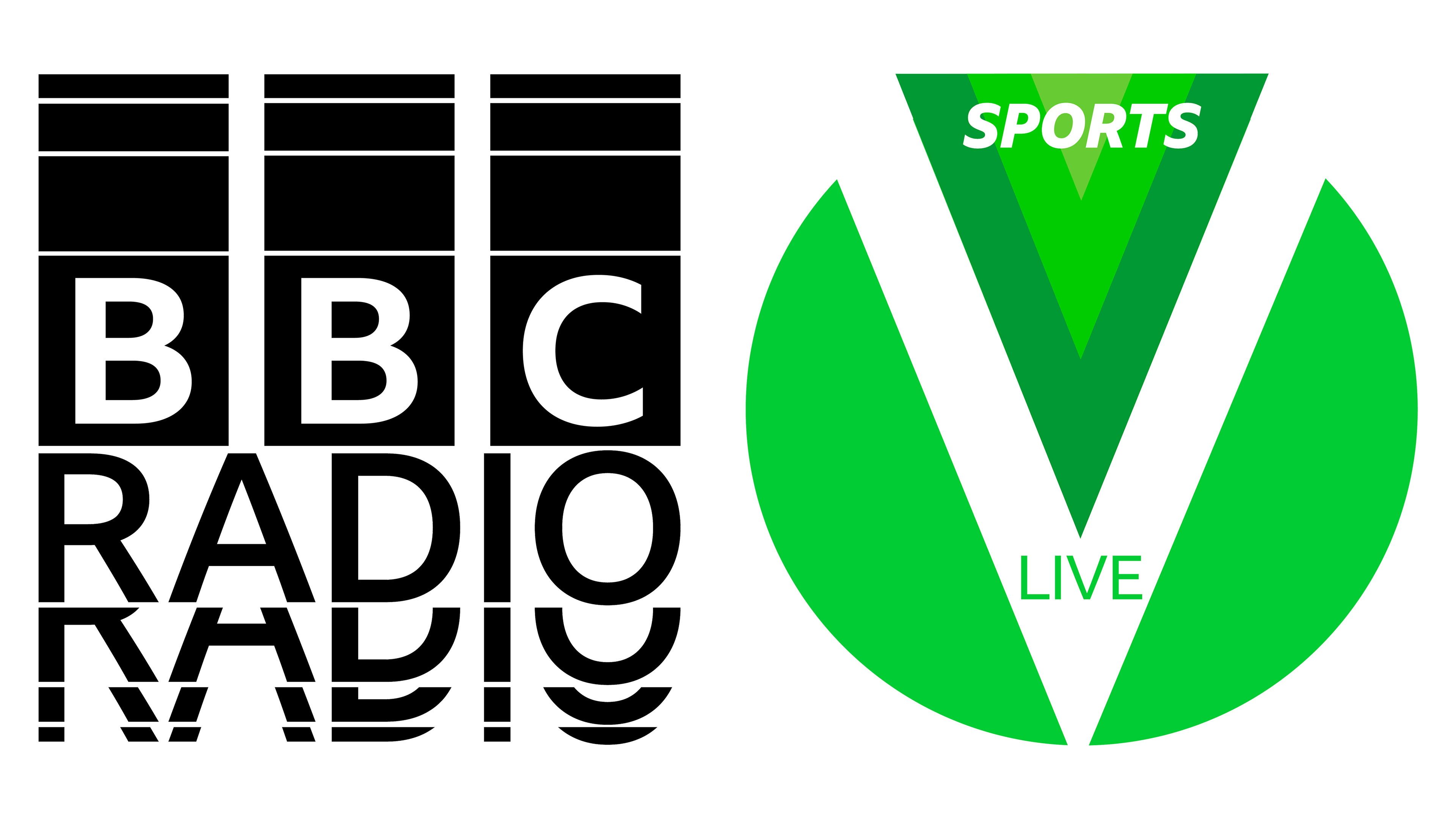
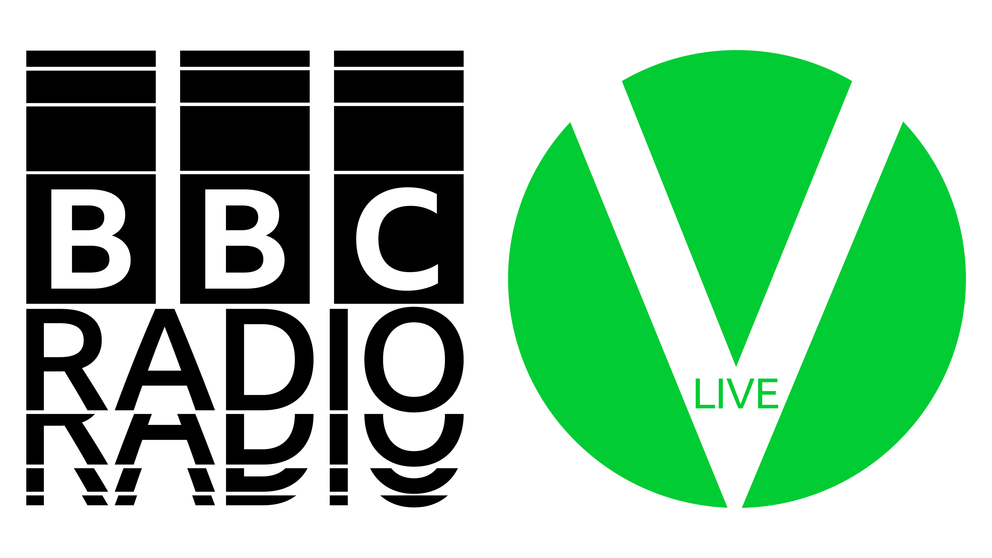
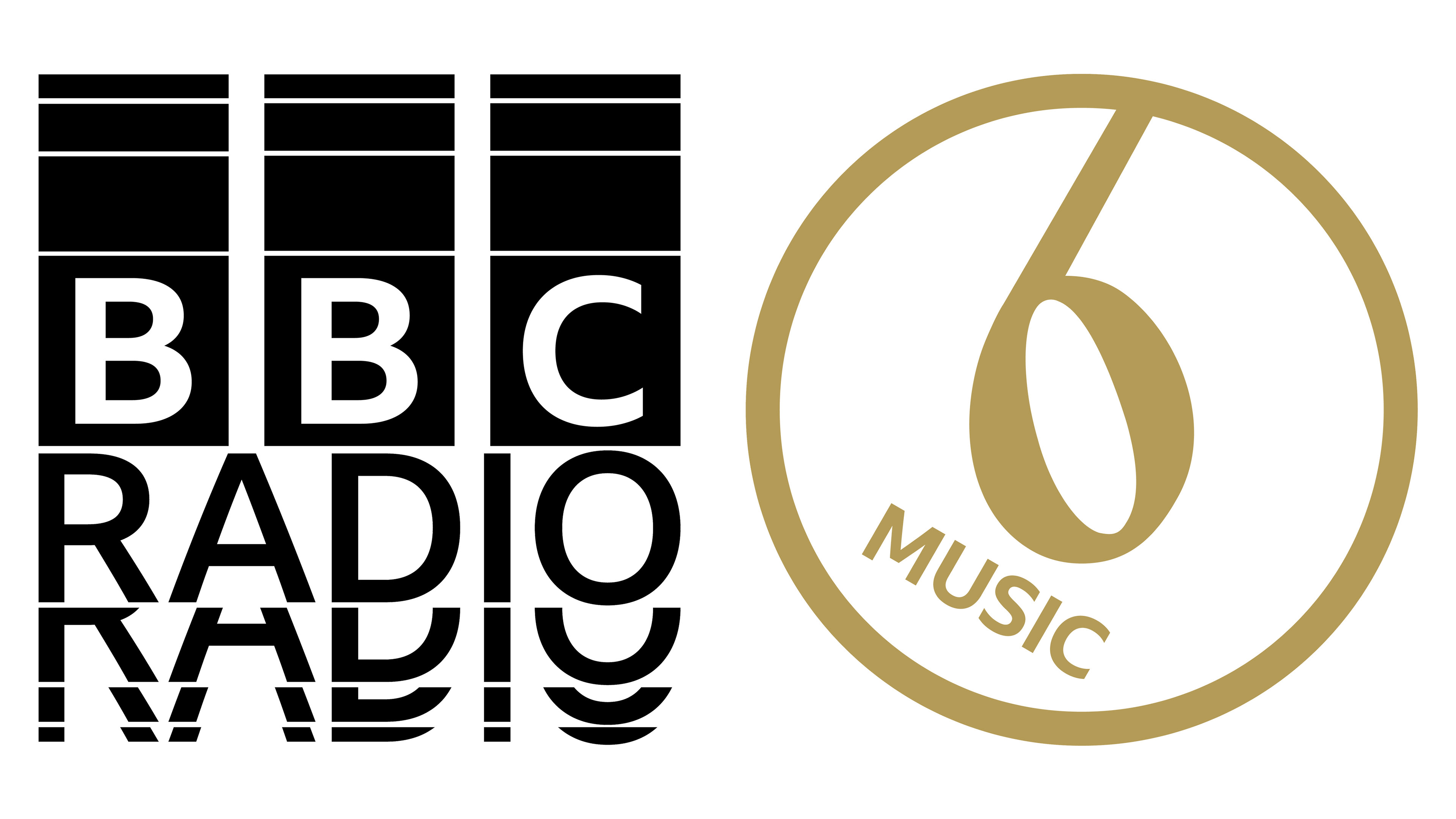
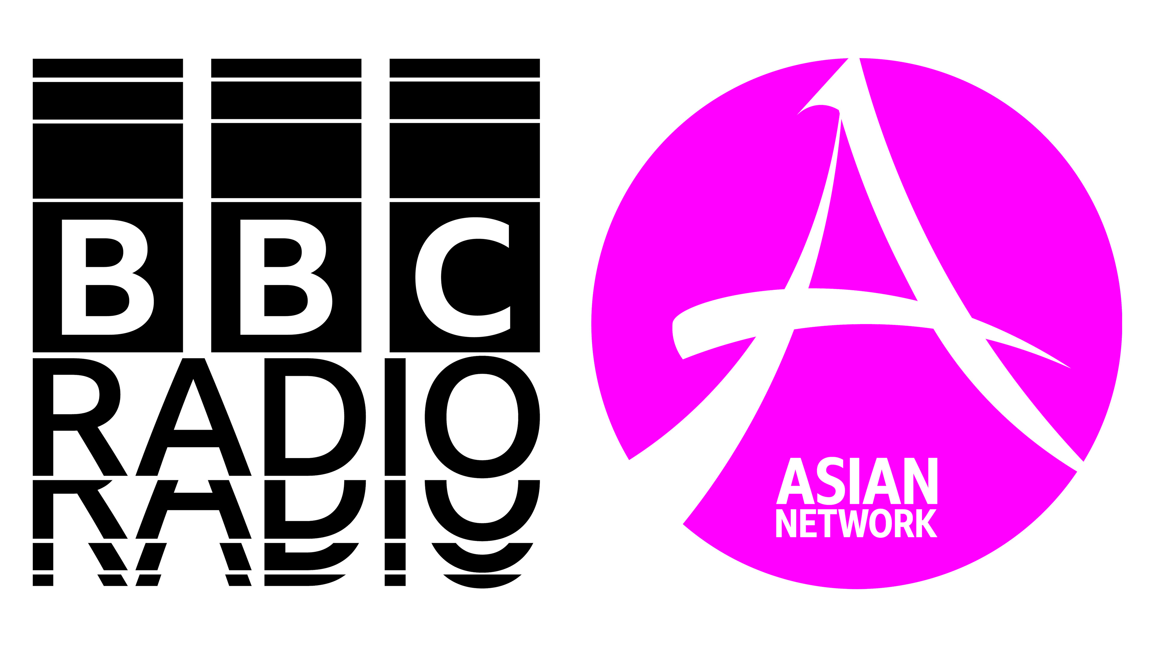
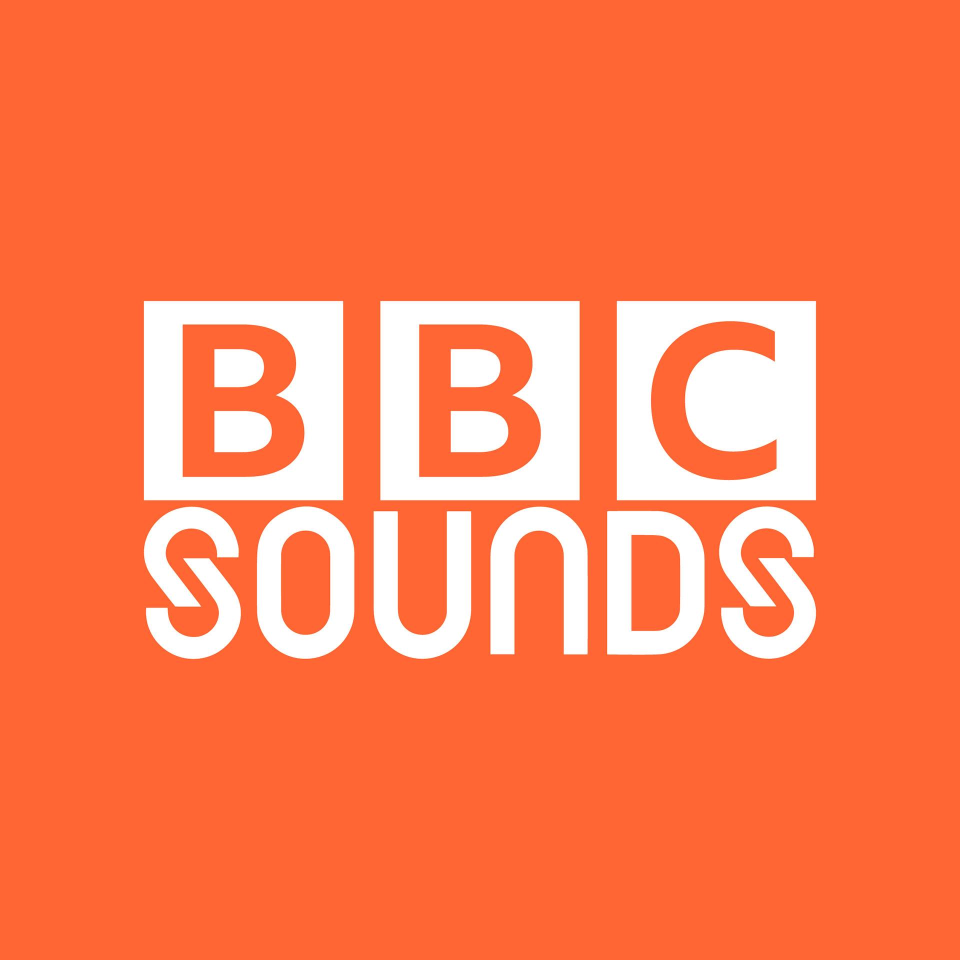
Official BBC Radio Stations (UK)
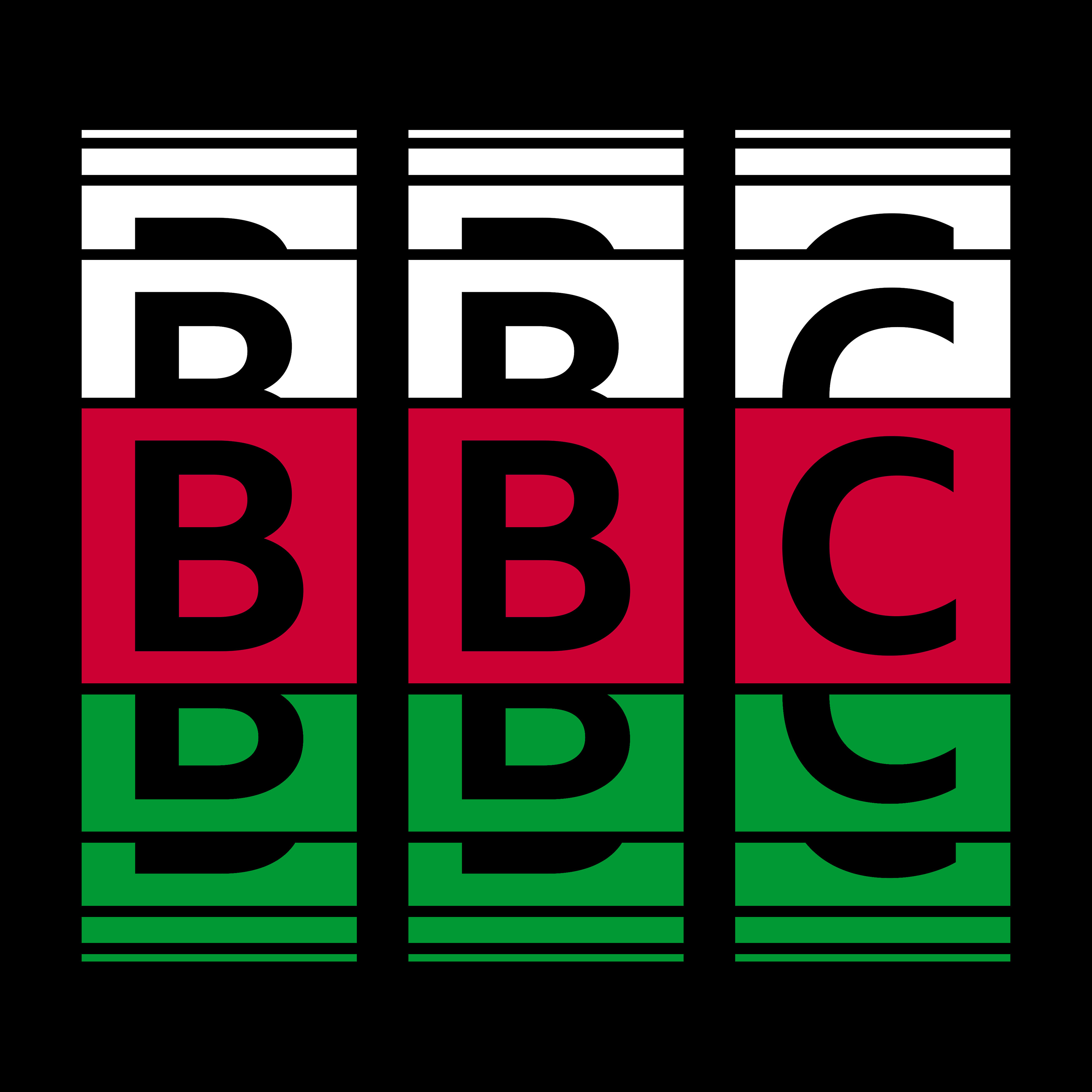
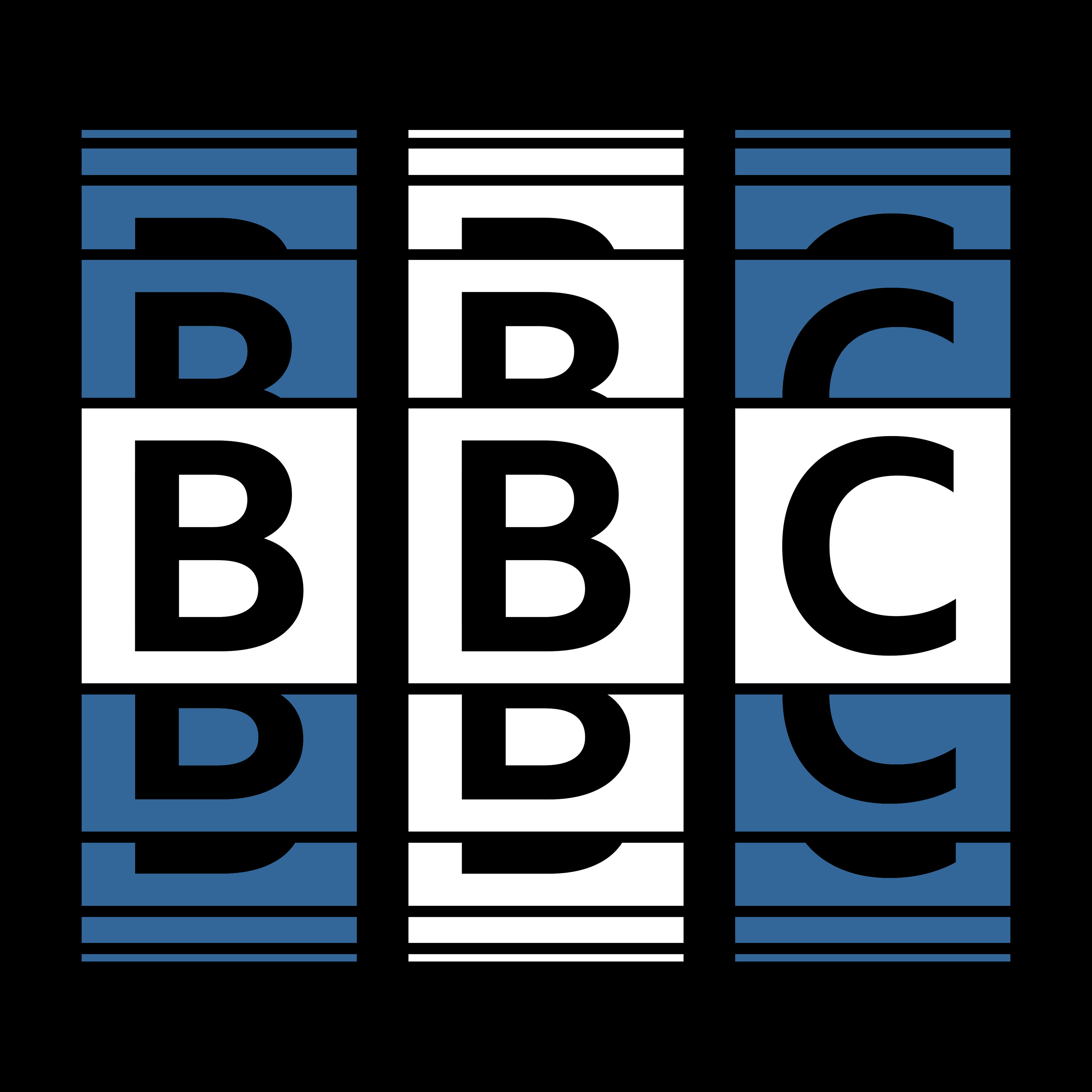
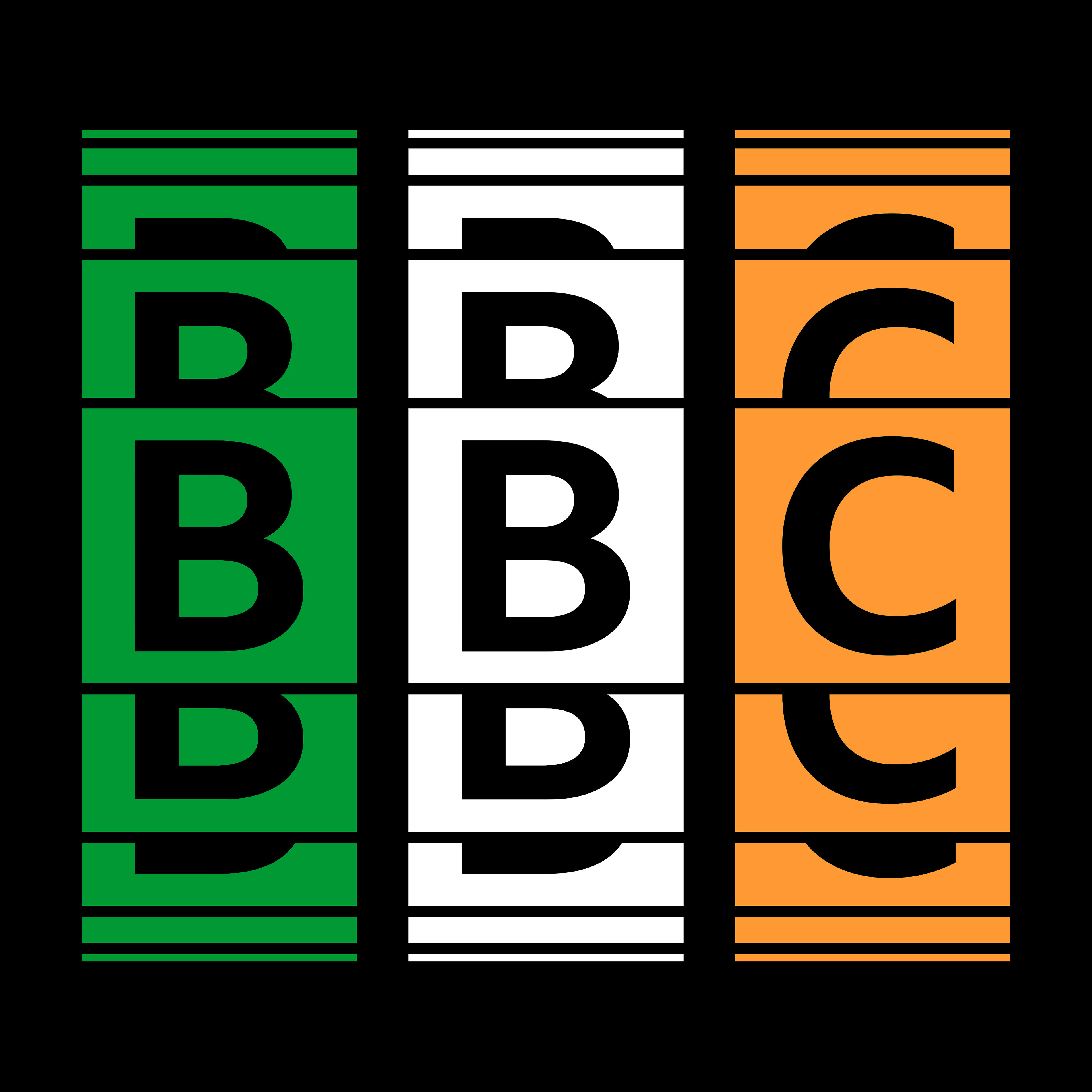
Concept Idea - "Country Waves"
Based on the inspiration of The 1975's graphic designs by Samuel Burgess-Johnson and the colors of the nationality flags of the British Isles.
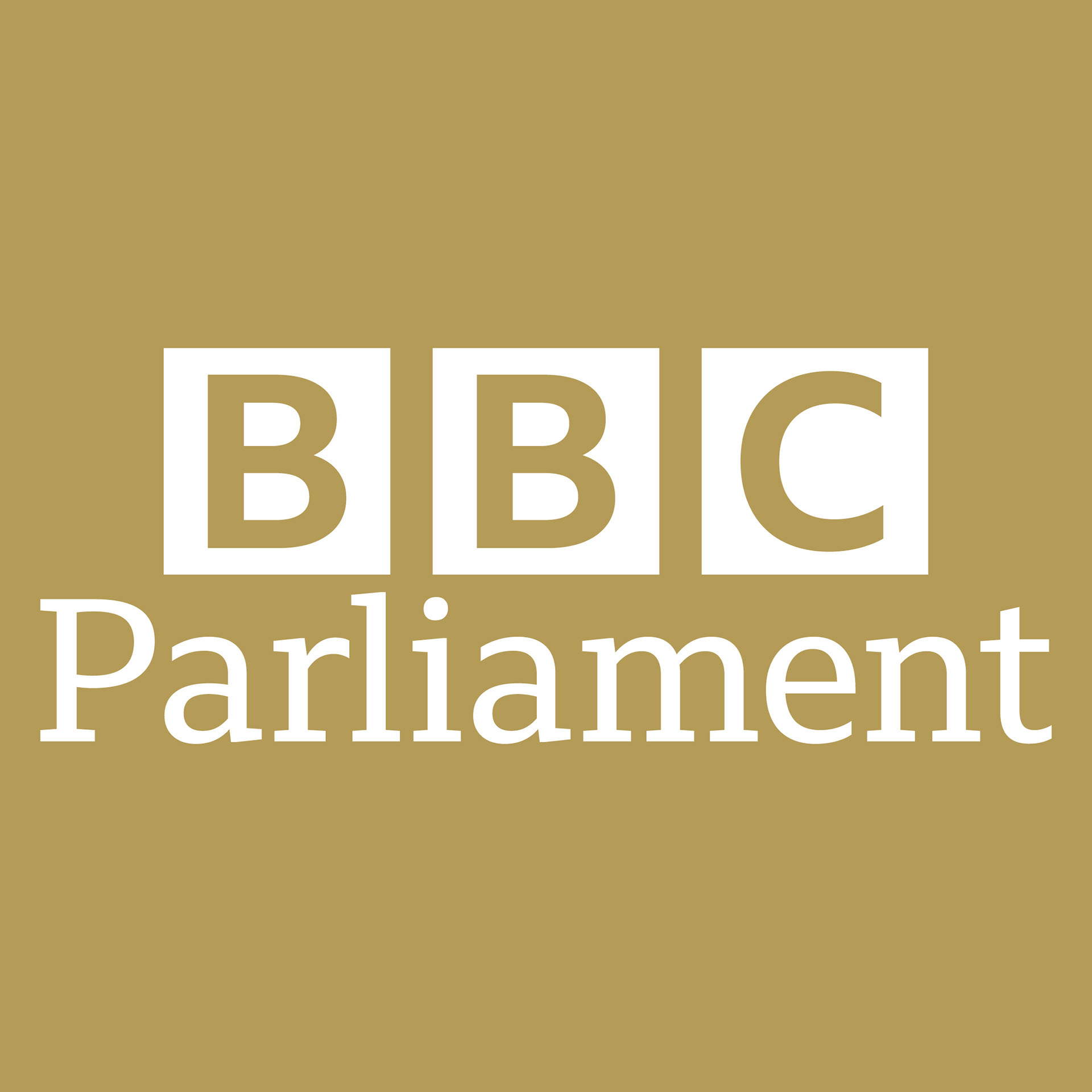
Extra Concepts (International)


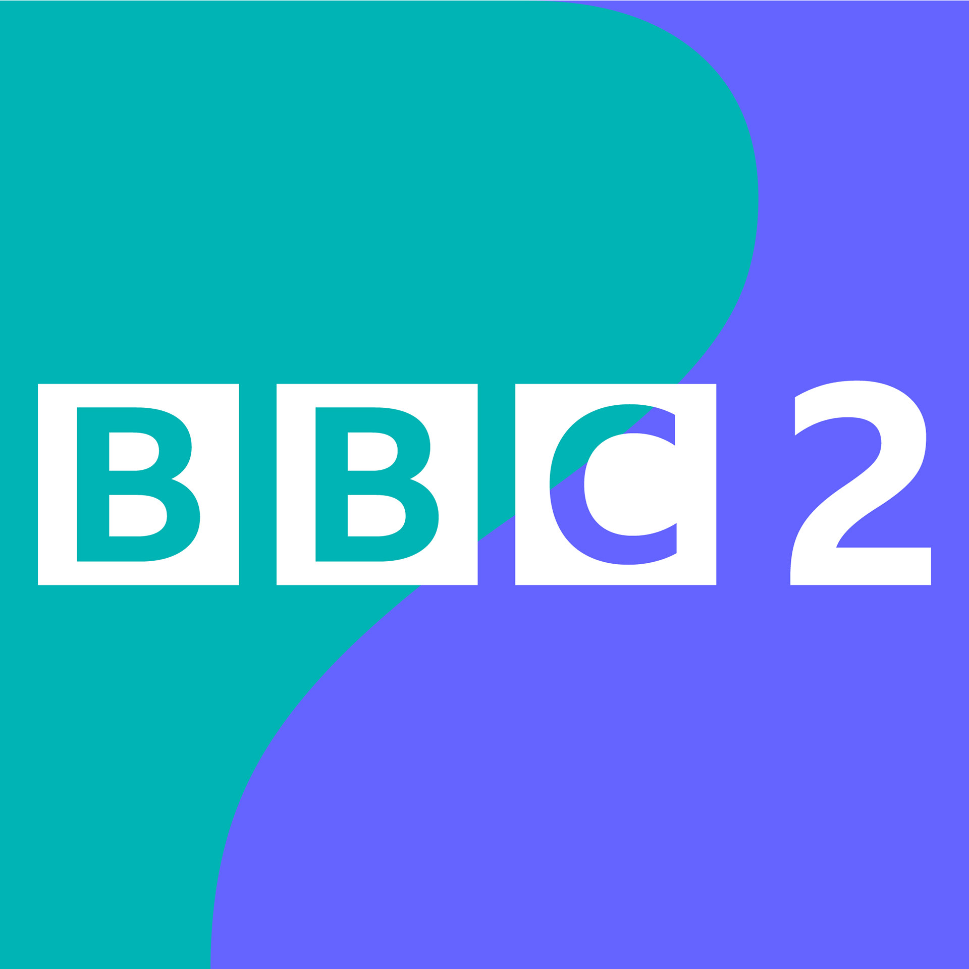
BONUS CONCEPT - BBC 2 Curve Idents with 'Reith' Concept
I hope you enjoyed looking the brand experiment! Leave a comment below to ask, to tell me what you think, and recommend other BBC logos for me to make a 'Reith' concept out of it.