
As an Olympics fanatic, I enjoy everything about the Games – the competitions and the artistry of the opening and closing ceremonies. The host country and city get the opportunity to showcase their culture, history, and excitement for hosting the games. My first memories of the Olympics were the 2004 games in Athens. As years passed, I became more interested in the variety of emblem designs from the genesis of the modern Olympiad in 1896 to the present, which, I believe, inspired me to become a graphic designer and artist. I have visited several Olympic parks and stadiums, including London, Munich, Lake Placid, Rome, Berlin, and Athens. While visiting Athens at the Panathenaic Stadium, I learned about Pierre de Coubertin and his idea for the Olympics, as shown below:

Coubertin’s dream was to overcome and embrace the differences between people, and my goal for this project is to express that dream visually. The more I studied and worked on designs, the more the images evolved to tell a story and to communicate Coubertin’s vision further – all while expressing the magical attraction of Los Angeles – the chosen host of the 2028 Summer Olympic and Paralympic Games. Motivated by some of the complicated history and the current problems of my home country, I want my designs to unite the people worldwide by acknowledging history.
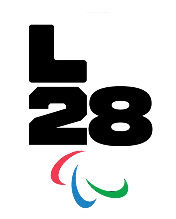
Emblem
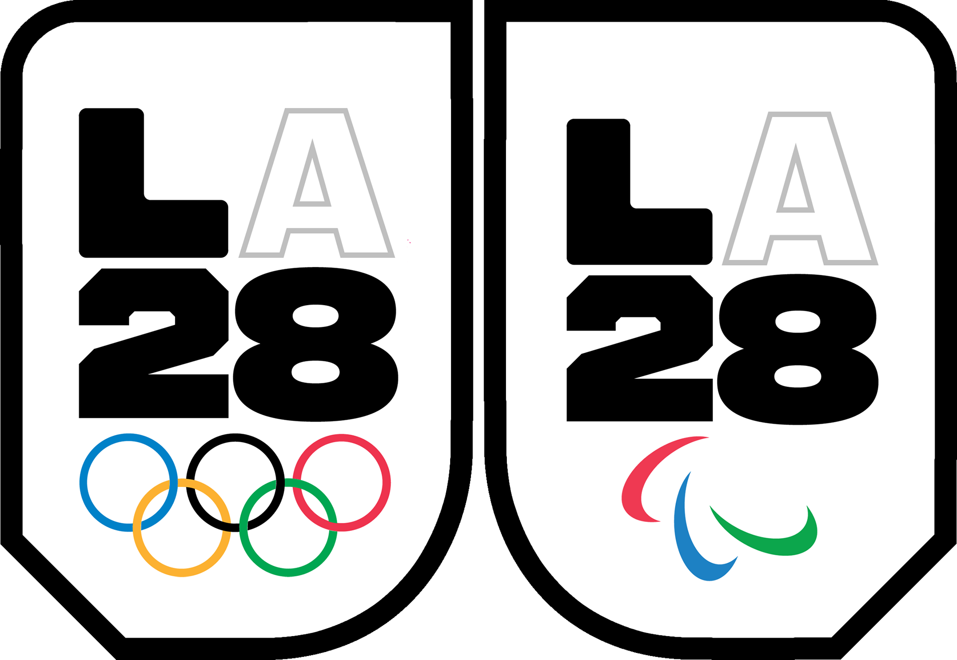
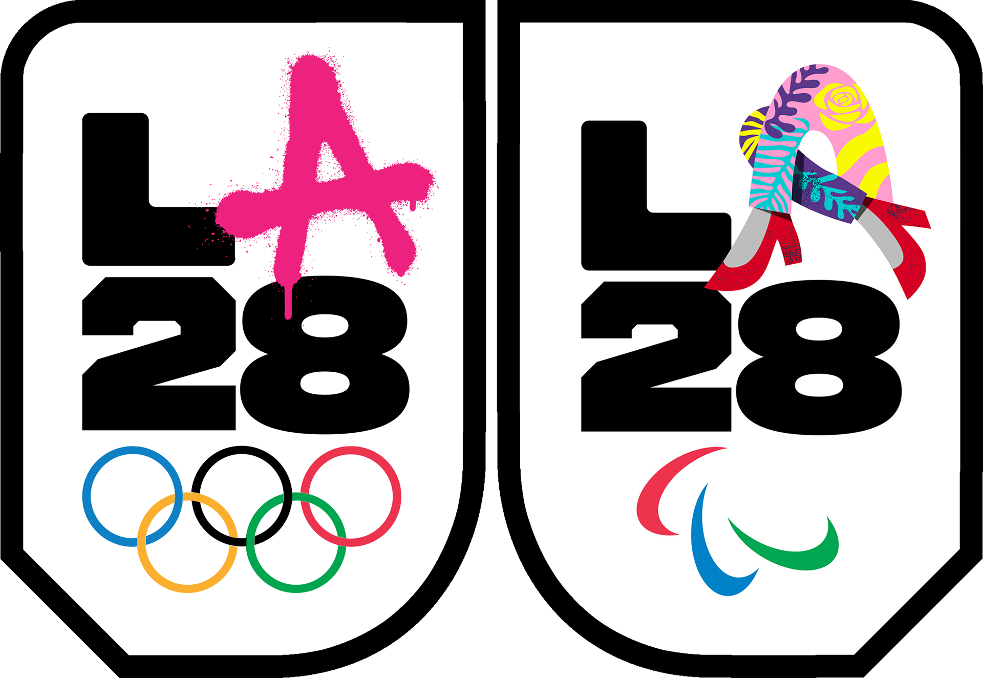
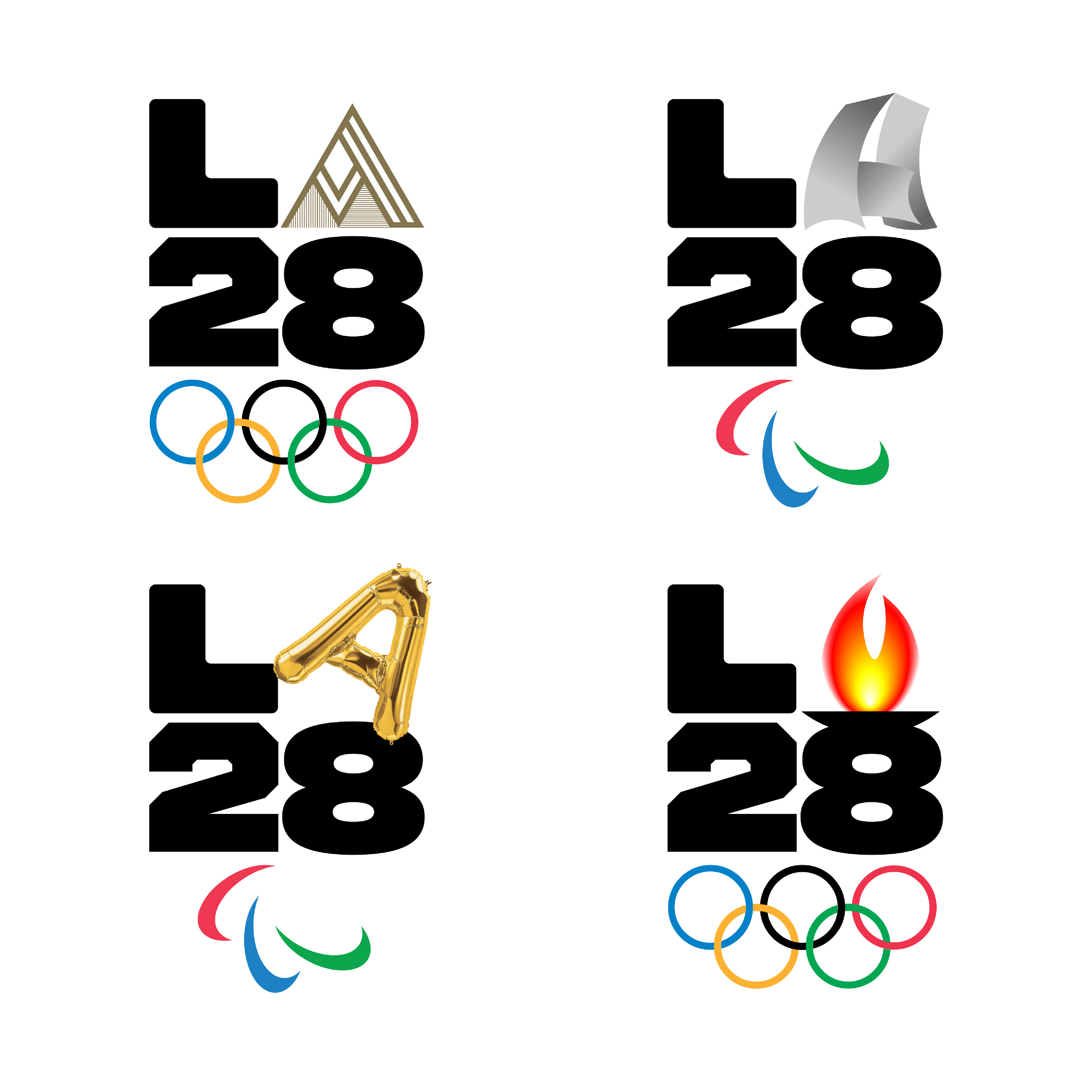
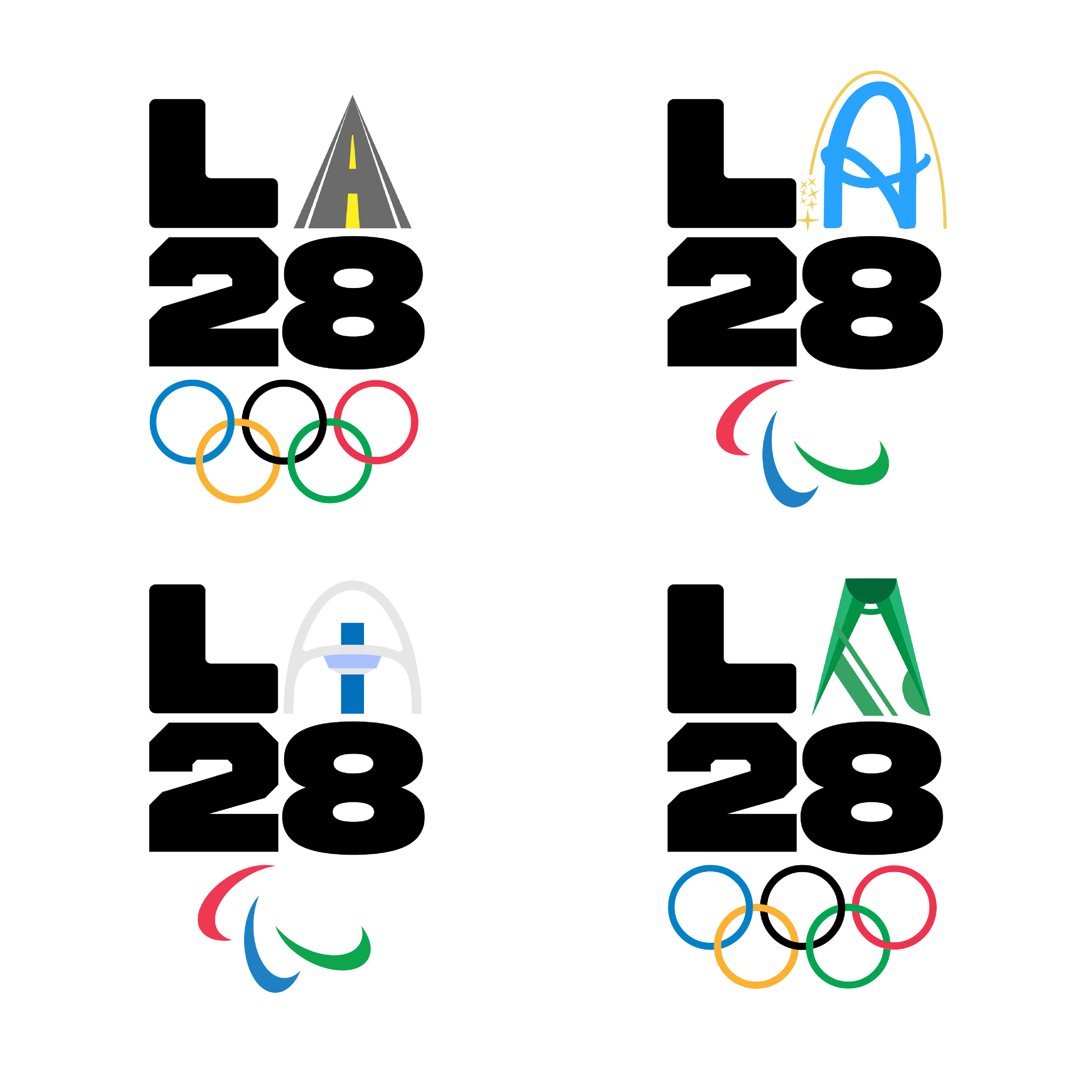
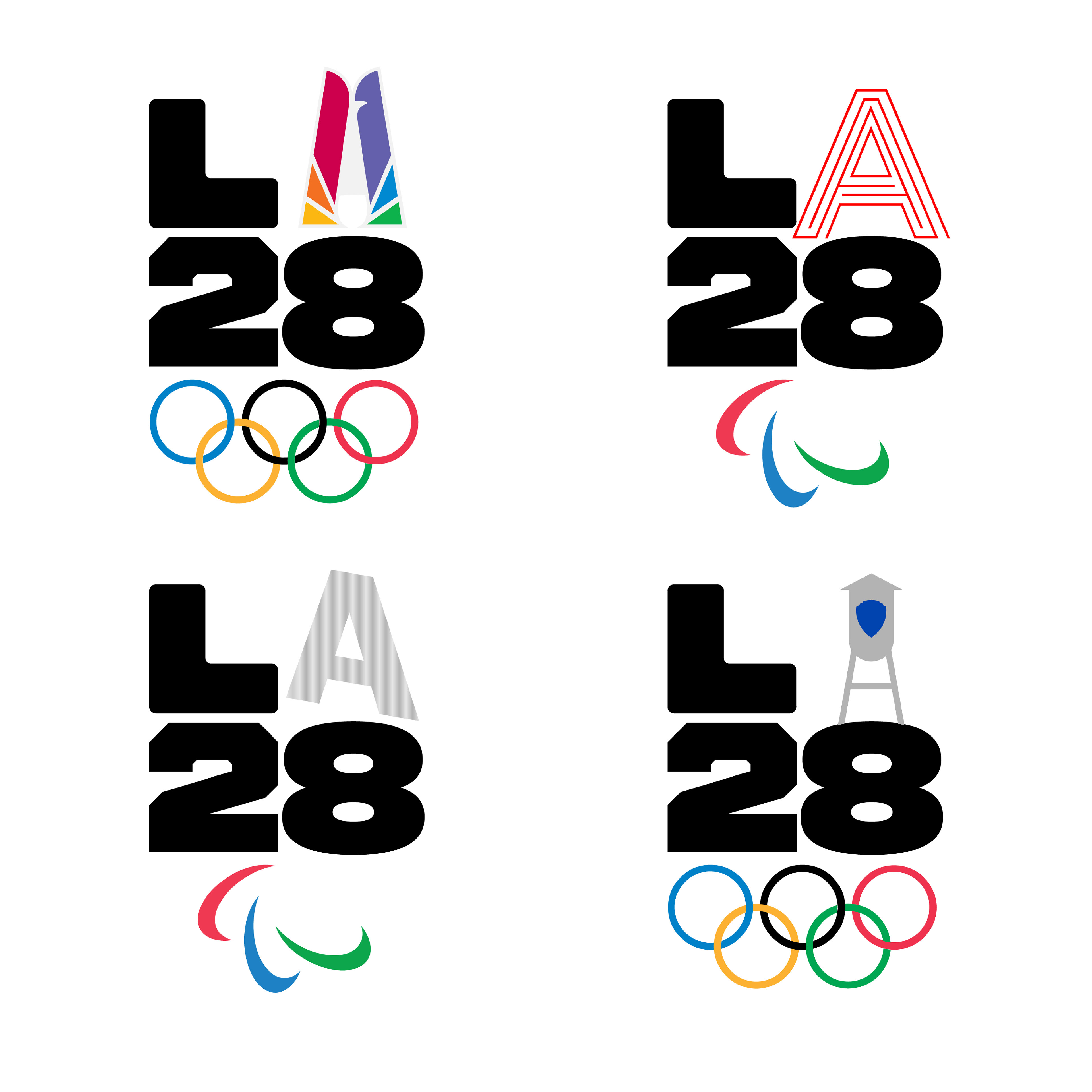
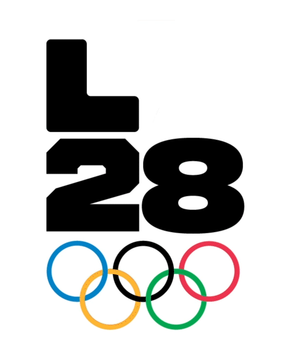
Based on the inspiration of “a city where everyone is different, and everyone belongs” (LA 2028, 2020), the LA28 emblem below is fastened with a bold and static letter L and numbers 2 & 8. But based on the dynamic nature of Los Angeles, the emblem is designed to evolve until 2028, allowing “for an exceptional spectrum of stories with an interchanging dynamic ‘A.’” (LA 2028, 2020) With this in mind, the image on the left represents a static template of the emblem to show where these different styles of A’s can, or will, be placed. Then, the right image shows two official emblems (as released by LA28) where the A’s change to represent the icons, stories, and the spirit of Los Angeles.
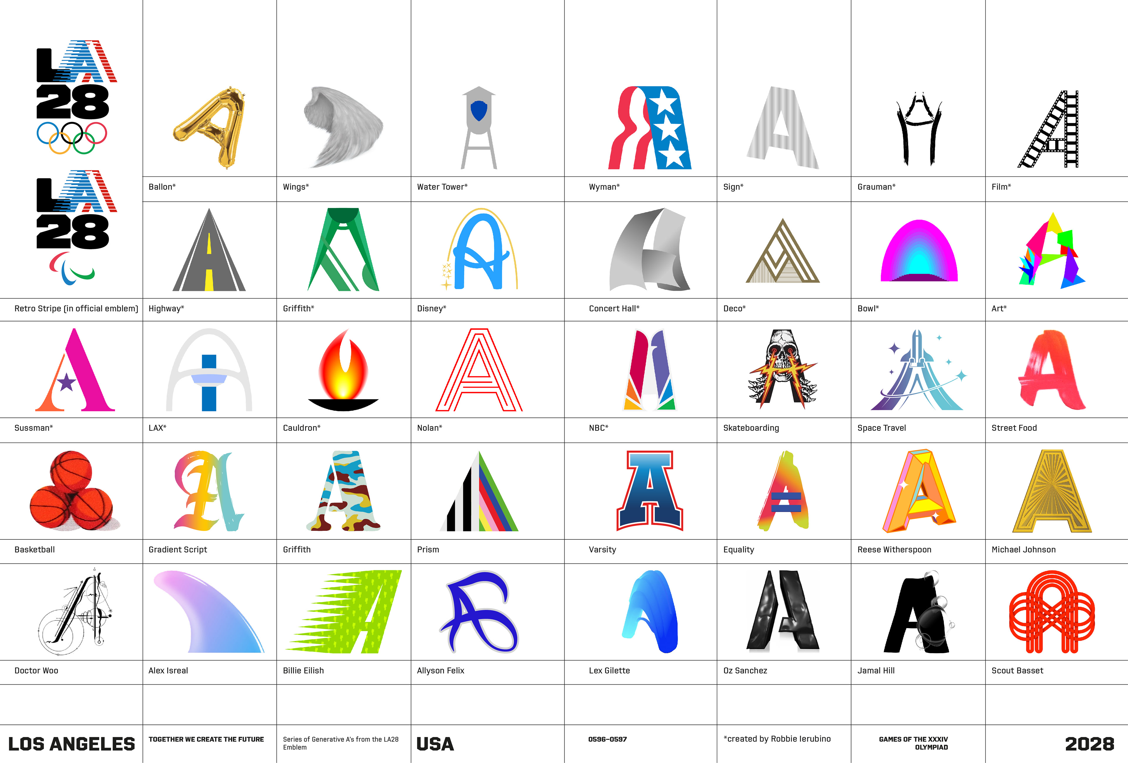
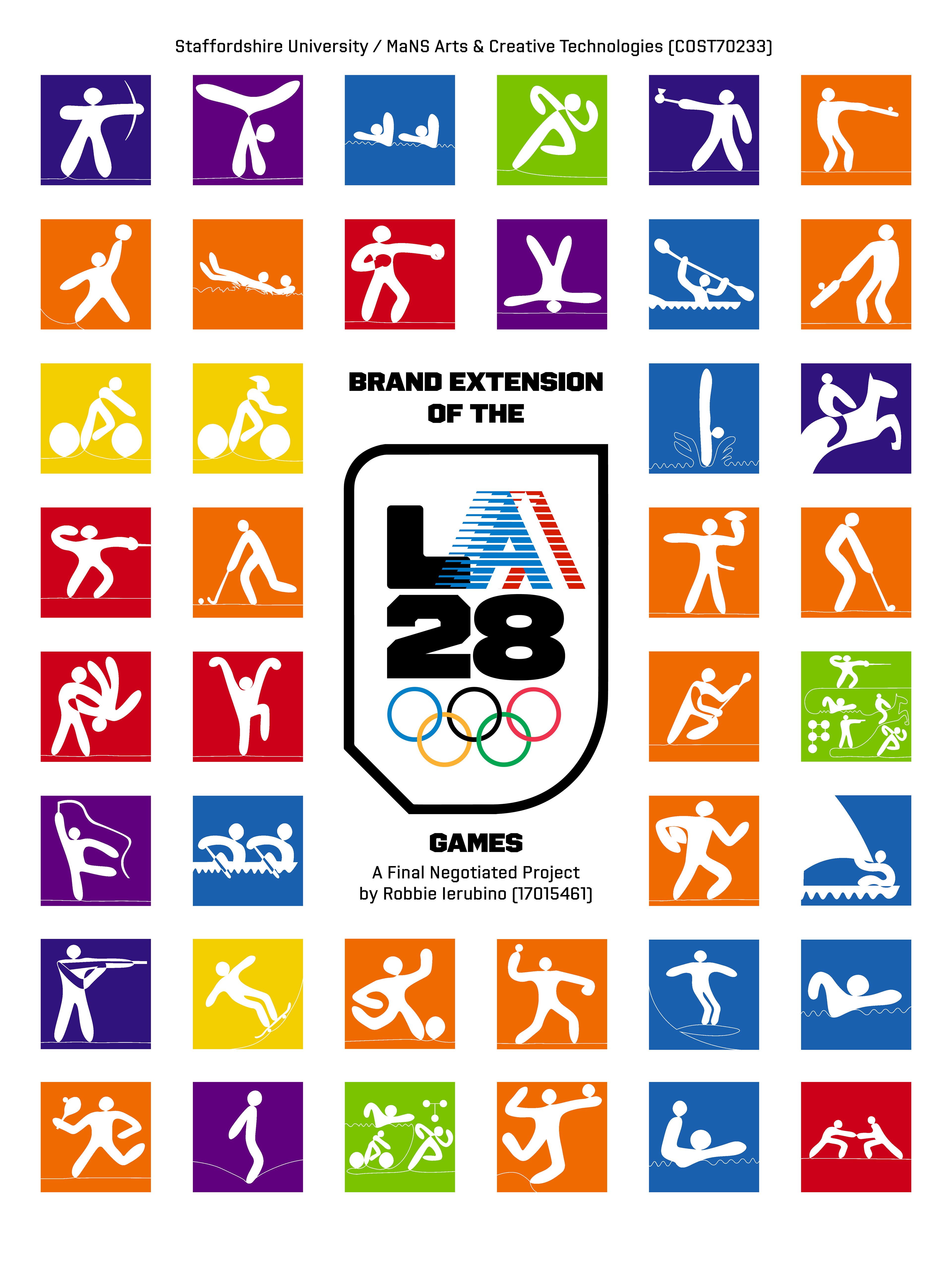
The first set of dynamic A's was revealed on September 1, 2020. Since then, a total of 36 have been made public, with more to come. I wanted to be a part of that creativity. During this project, I enjoyed designing 20 new A’s to expand the emblem. After discussions with my supervisor, we felt that there was a need to represent the experience, history, and cultural landmarks of Los Angeles. Since each Olympic logo evokes different aspects of the host city and country, Los Angeles could benefit from telling these other stories through their dynamic A. While researching the history, attractions, looks, and facts about Los Angeles, they can provide curiosity to those who may want to travel to the city and the nostalgic excitement as a host city once again. The image gallery on the right shows 20 dynamic A's I created as part of this project.

Main Marks
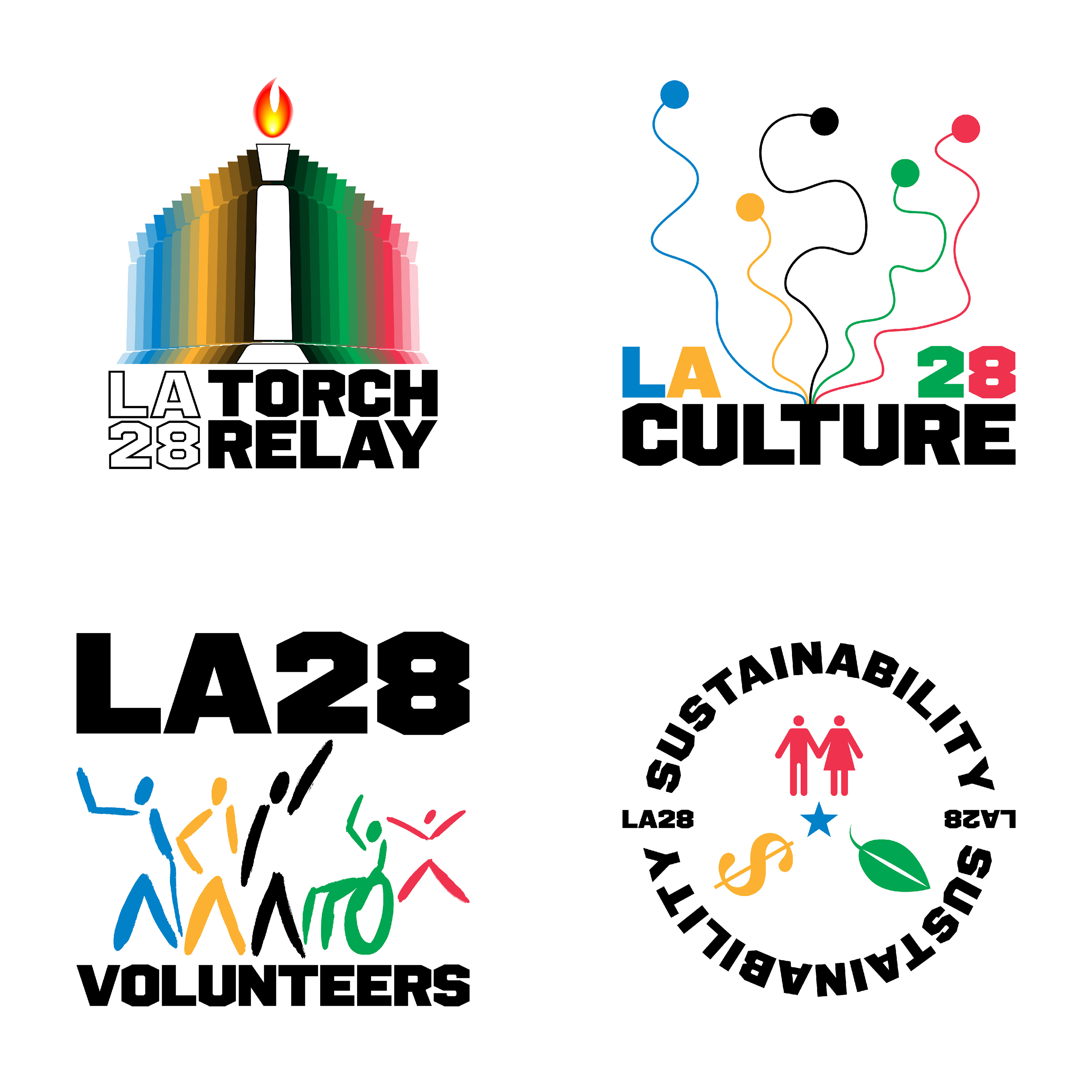
In the words of Markus Osterwalder (2018), “The emblem is the most characteristic visual element of the Olympic and Paralympic Games, and it communicates the vision and the values of the Games. However, additional marks are designed to accommodate the needs of important programs, like Volunteers, Culture, and Environment. Due to their special importance, they are called main marks.” For this project, I decided that the areas of the torch relay, culture, volunteering, and sustainability were the programs for the LA28 Olympic and Paralympic Games that will stand out to further the message of togetherness through creativity, action, and service. The four main marks I created are designed for these exceptional programs of LA28 and use a similar color branding based on Olympic rings. I wanted to develop these main marks as an extension of the overall LA28 brand. They serve as reminders or links to events and venues around the city and the Games themselves.
The torch relay mark design (top left) is based on the cauldron from the LA Memorial Coliseum. The icon is a repeated pattern that may recall an ancient Greek temple to represent the birthplace of the Olympics and the origin of the Flame itself.
The culture mark (top right) shows five pathways coming together from their dots to the letter T in the name, “culture.” The paths represent people from different communities worldwide joining as one big group, like the idea of “the Great American Melting Pot” from the early 1900s.
The volunteer mark (bottom left) shows a group of stick-figured people with differences, such as disability, age, race, gender, and more. Its illustration evokes the building of a diverse community.
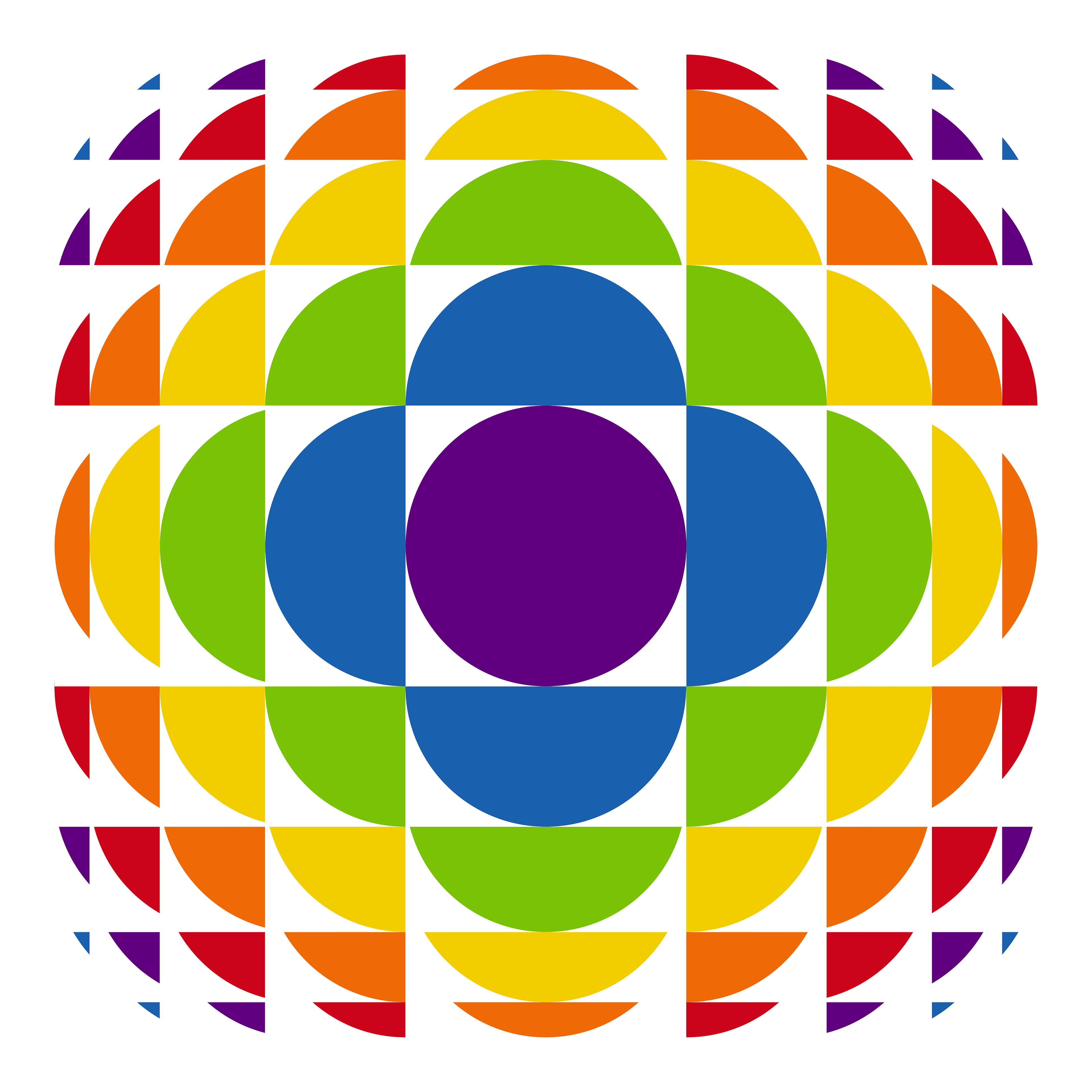
The sustainability mark (bottom right) is based on the Venn diagram of making a sustainable area. The human figures represent society, the leaf represents the environment, the dollar sign represents economics, and the star represents the sustainability within the host city itself.
(Kinetic) Pictograms
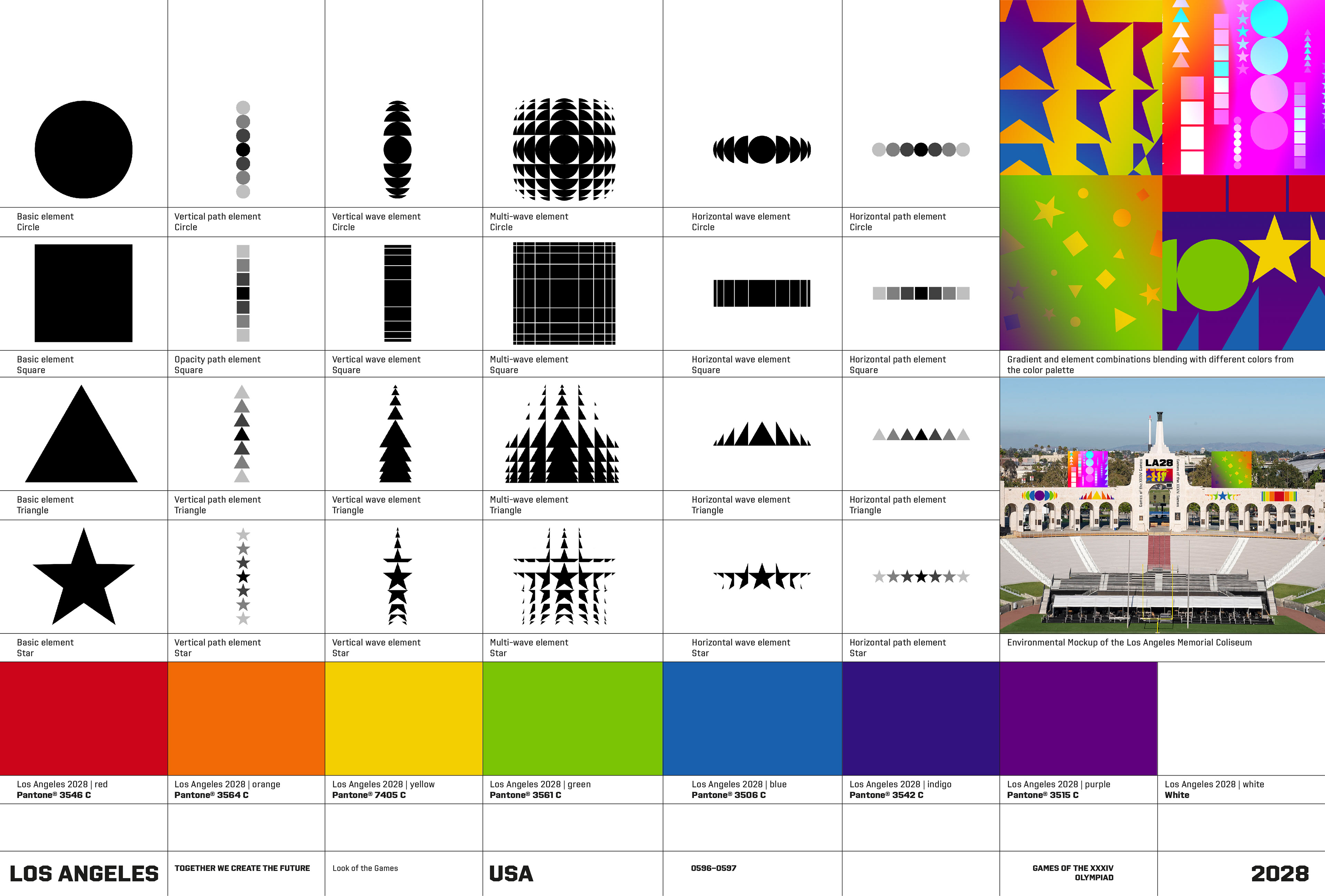
My primary focus on this project was creating pictograms. Pictograms have played “a pioneering role and enjoy a special status: for decades, their simple, unambiguous representation of athletes, typical poses and/or sports equipment have been a key element of all Olympic Games.” (The Olympic Design, 2018) For this project, I designed and created the sport pictograms shown below. These pictograms are based on contemporary styles made from continuous drawings. The linear strokes used to create the images represent a timeline and, hopefully, bring nostalgia for the Games. Two versions of the pictograms have been created: colored figures on a white background and white figures on a colored background.

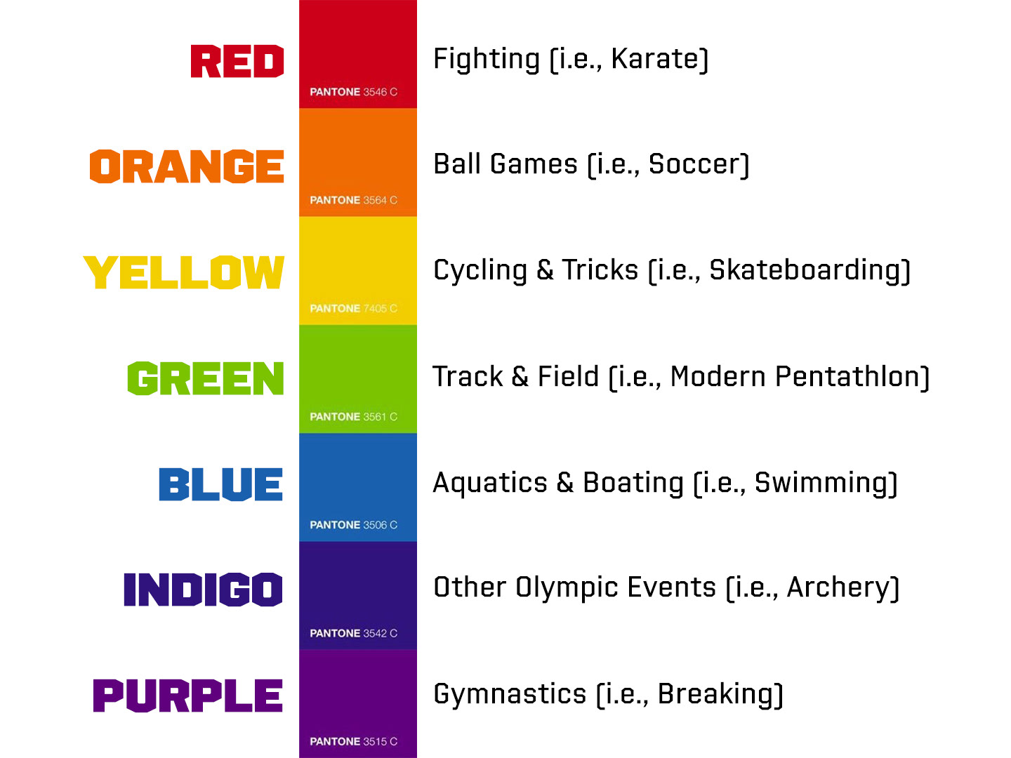
Most pictograms from past games reflect a single-color scheme. However, the LA28 pictograms are color-coded to represent a type of Olympic or Paralympic event. Since prior Olympic pictograms did not have a color-coded system, I wanted to raise the level of the visual language. The key representation of the color and types of events are presented on the right.
The revolutionary use of pictograms at the Olympics debuted at the 1964 Tokyo Games. Regarding their imagery, “their key element is to be simple, clear and easily understood by people with a wide range of backgrounds.” (The Olympic Design, 2018) Nearly 60 years later, when the Games returned in 2020, Tokyo revolutionized them by becoming the first to display pictograms in motion, or kinetic pictograms that “appear as a series of three movements: appear, static, and disappear.” (The Olympic Design, 2018) But for LA28, my pictograms will be going in a different direction. The video below shows that each pictogram comes to life by “zooming in on a square” before a continuous line animation draws the desired image. After the shape is completed, the figure is filled to reveal its static look (which can be used separately as a standalone image). Finally, the static drawing vanishes back into the single, small square, as if it is ready to draw another figure. Since creating motion graphics was one of my goals for this project, I wanted to introduce motion within the pictograms. These kinetic images were a unique challenge, but they provide a better and more unique communication style.
Typeface
The branding of the LA28 Games features a custom typeface (aptly named “LA28”) created by LA-based, MCKL. The typeface design below is used for logos, headlines, and text. It is inspired by LA’s urban culture, experience, and iconic attractions, such as the famous Hollywood sign. I believe these designs provide a sense of joy and ponder the inquisitive nature of the LA28 Games. Currently, there are only three available versions of the LA28 typeface. I hope these will be fully released in different weights and widths (and as a variable font) for designers to use.
Look of the Games
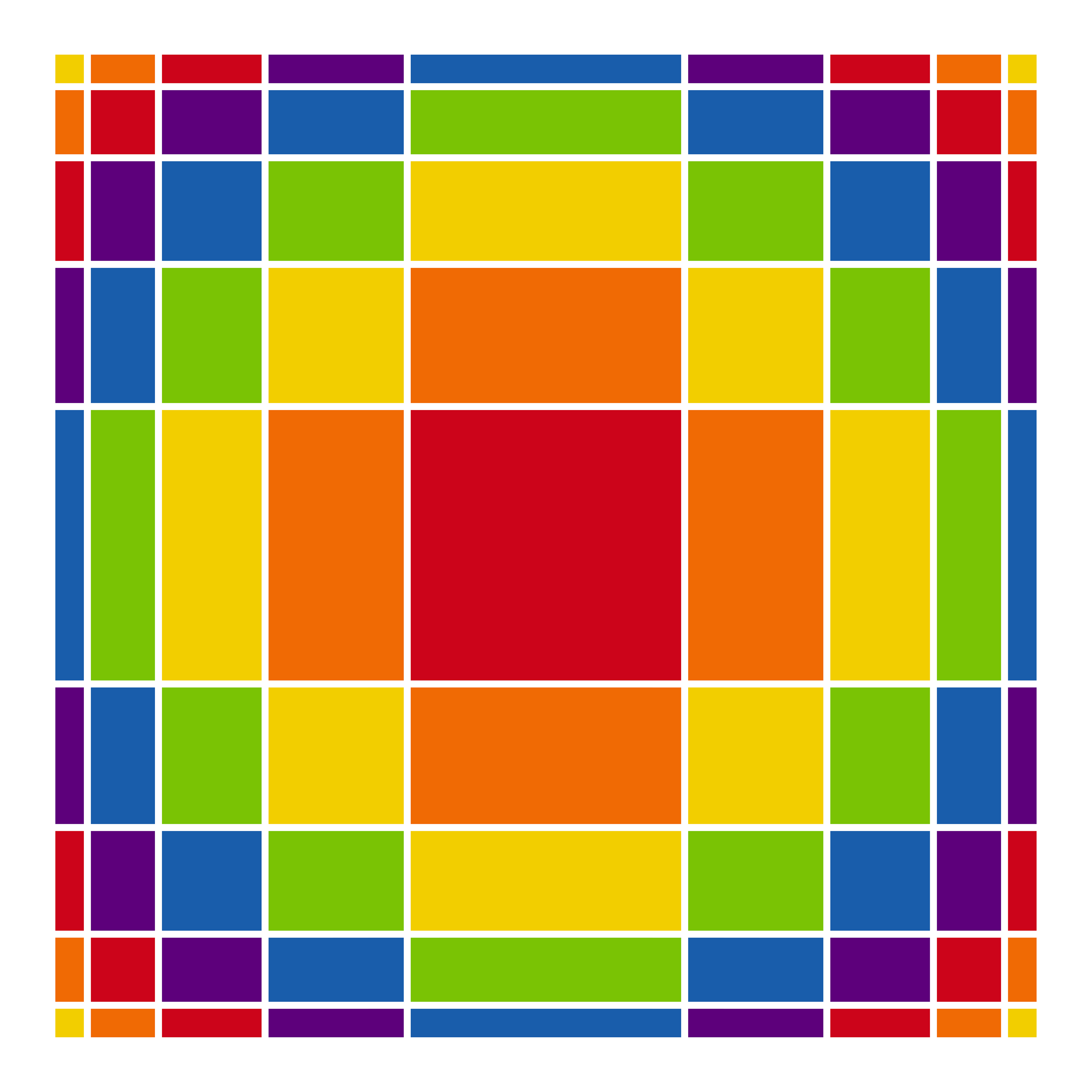
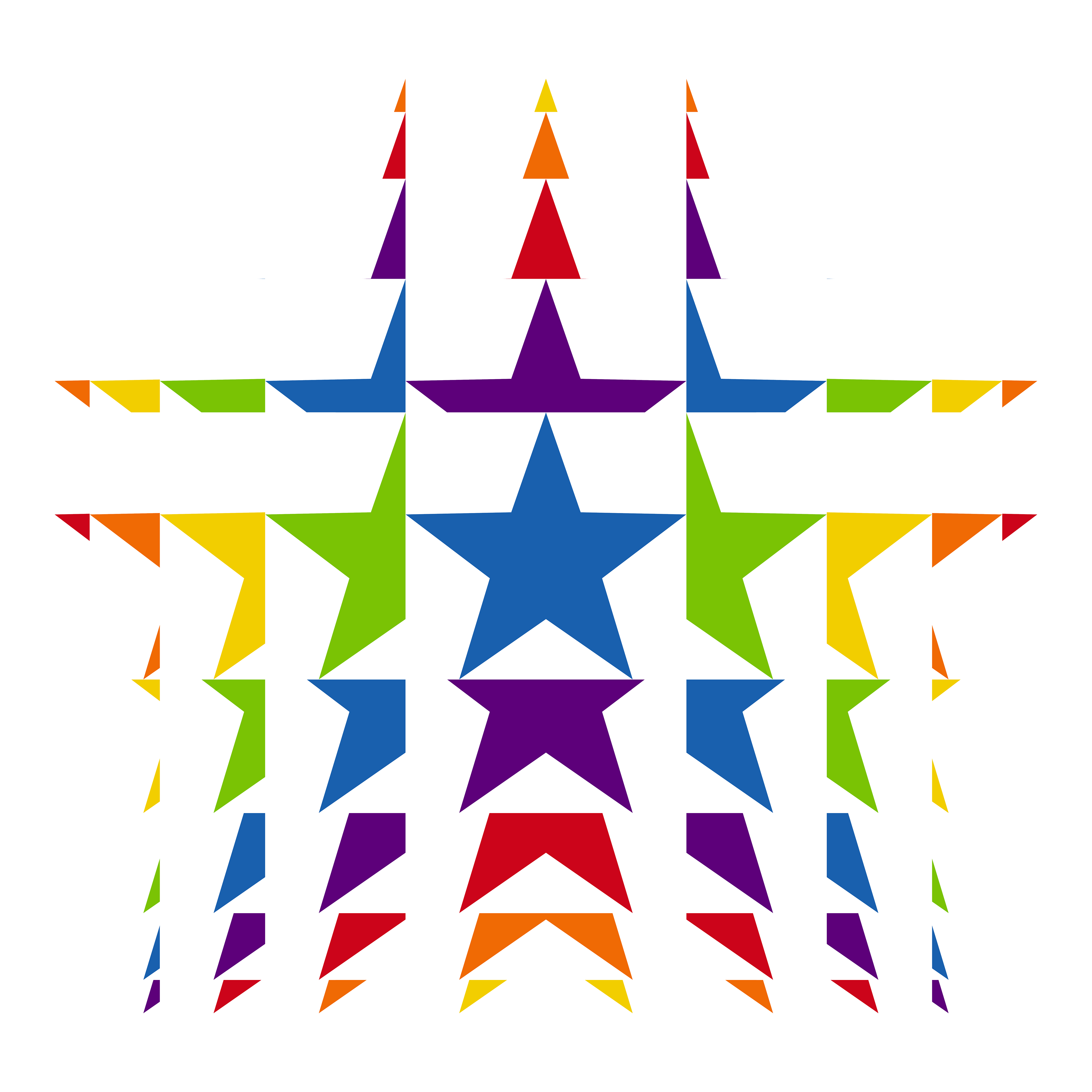
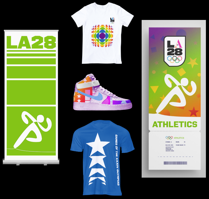
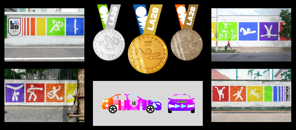
My look of the Games for LA28, as shown below, was first inspired using emotionally symbolic colors as set out in my pictograms. They can be displayed alone, in a gradient pattern, or blended. The square shape is used to create a minimal look – inspired by the 1980s vaporwave art and retro-futurism pattern designs. Circles, triangles, and 5-point stars are inspired by the “confetti” graphics used in Deborah Sussman’s look of the LA 1984 Olympic Games. Since the 1980s-style design is popular again today, I wanted to create nostalgia for the last time LA hosted the Olympics in 1984. The pictograms may also be incorporated into the look, while still fitting into a square. I have been artistically combining the colors and shapes in these different styles, with a goal for the viewer to feel the desired and joyful atmosphere through virtually experiencing diverse activities, cultures, and icons of Los Angeles. In short, they can act as a travel brochure for LA. I have been inspired by the layouts and visuals from past Games. During this project, I have accepted the incorporation of standardized branding, color, and other thematic areas. I believe that these elements will continue to be incorporated when designing future works.

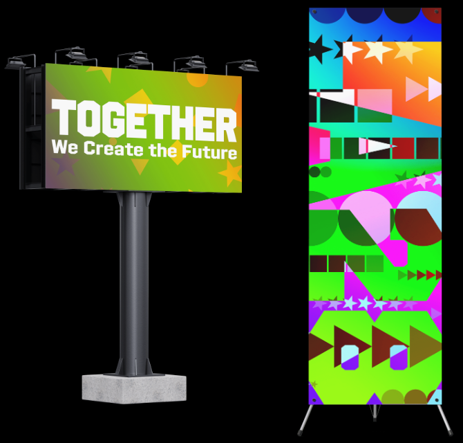
The Games’ look is based on the LA28 slogan, “Together We Create the Future.” It incorporates and reflects on Coubertin’s dream with US history. Pierre de Coubertin founded this international event to bring liberty, equality, unity, and diversity for every athlete, leader, and citizen worldwide. “[The Games] are global. All people must be allowed in, without debate,” he said. “A better world could be brought about only by better individuals.” (Olympics, N.D.) This includes learning from our collective history to become a more tolerant people.

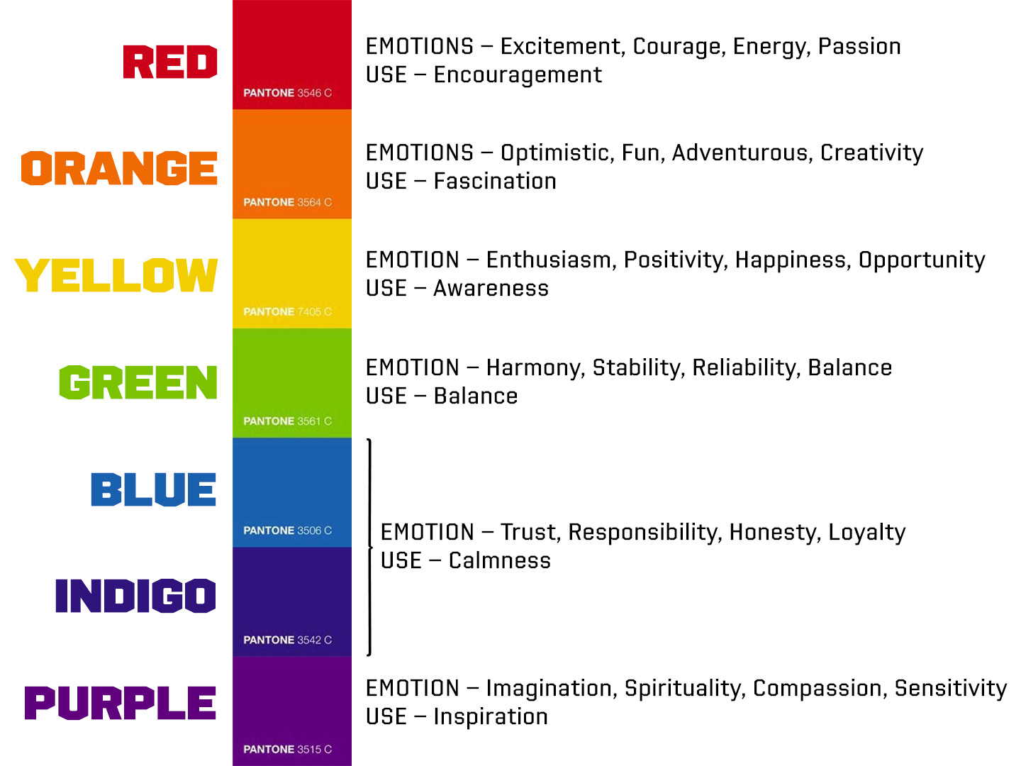
The use of specific color in the design of the pictograms and the look of the games is purposeful and represents “our moods, emotions, and behaviors.” (Canva, N.D.) Further, they should still be symbolic within the brand. The branding of the LA 2028 has a multicolor representation, with each color representing a different aspect of the desired personality trait. The list on the right depicts the brand colors and the intended emotional response of the viewer, as described from Graf1x (N.D.).
Overall Summary
While studying and designing for the LA28 Games, I realized the official design featured the first dynamic identity brand in Olympic history. Based on the research by Irene van Nes (2014, pg. 155), the spirited branding of LA28 is a generative type, which features at least “one of the elements of the identity” that “gives the brand a living character.” The emblem allows its brand to “be influenced by external data,” placed in the representational A’s. It can also “reflect the world it is living in and adapt in response to its input” – such as cultural highlights and current events.
The updated Olympic motto, “Faster, Higher, Stronger – Together” (Olympics, 2021), reminds us that it was not created to encourage athletes to beat or play faster, higher, or stronger than their opponents. They were established to create a peaceful community, build higher standards against discrimination, and create more solidarity for national and international relationships. This motto is also the intended theme of all Olympic and Paralympic designs.
I knew that the style of the created designs for this project might be summed up as “artistically and technically modern.” But I believe we have reached back to past Games, kept the familiar aspects, and updated them to be dynamic and playful. I predict by 2028, video screens and augmented reality will become more prevalent, and such vibrant imagery will be used more frequently. However, we have ensured that static images match their dynamic partners. So, when used, they fit with the overall brand of the LA28 Olympic Games.